LineChart
Last updated
Was this helpful?
Last updated
Was this helpful?
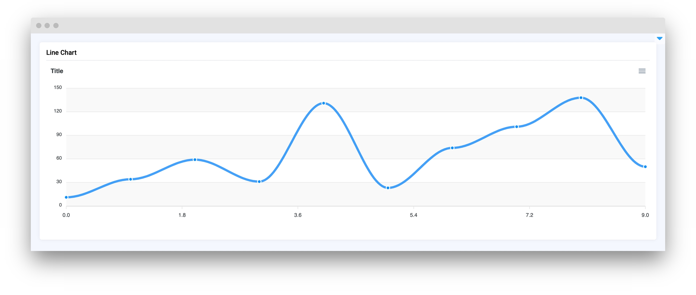
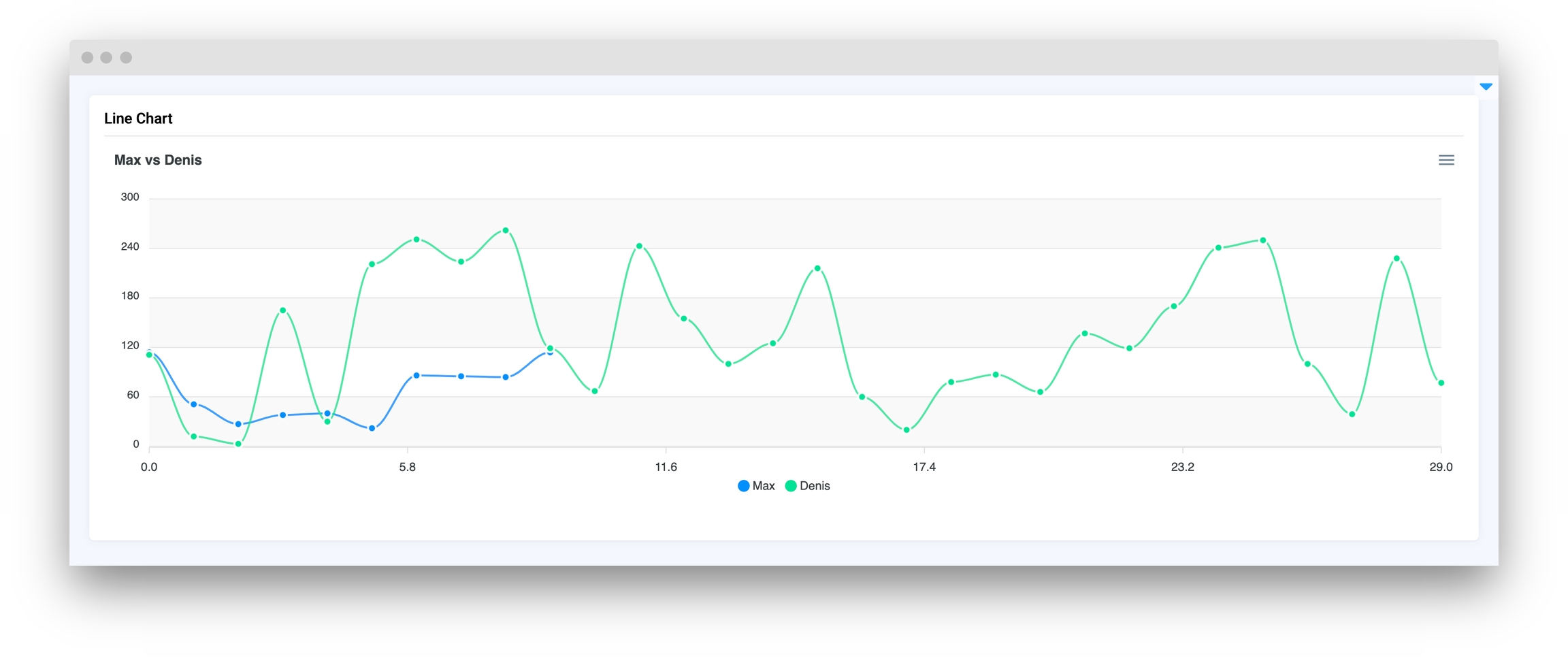
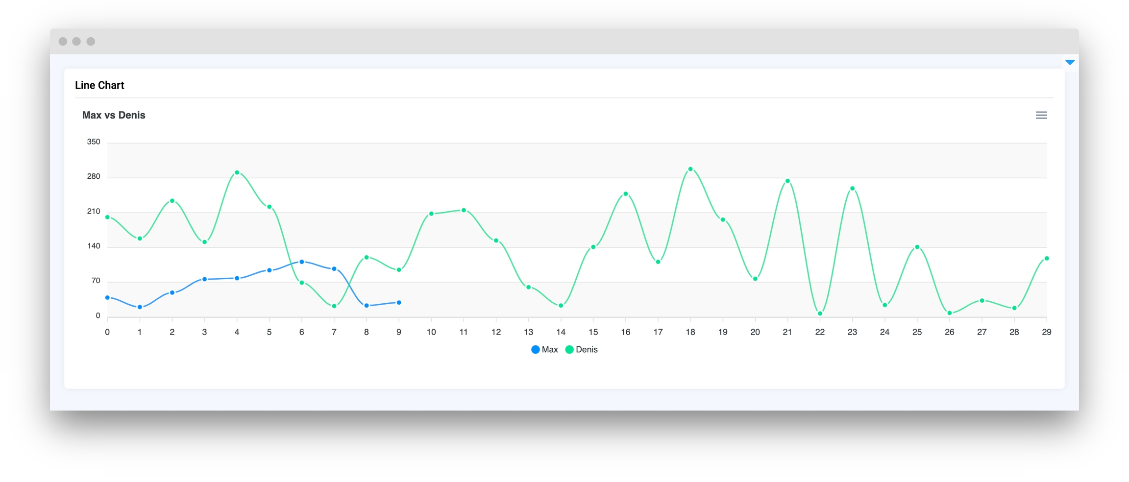
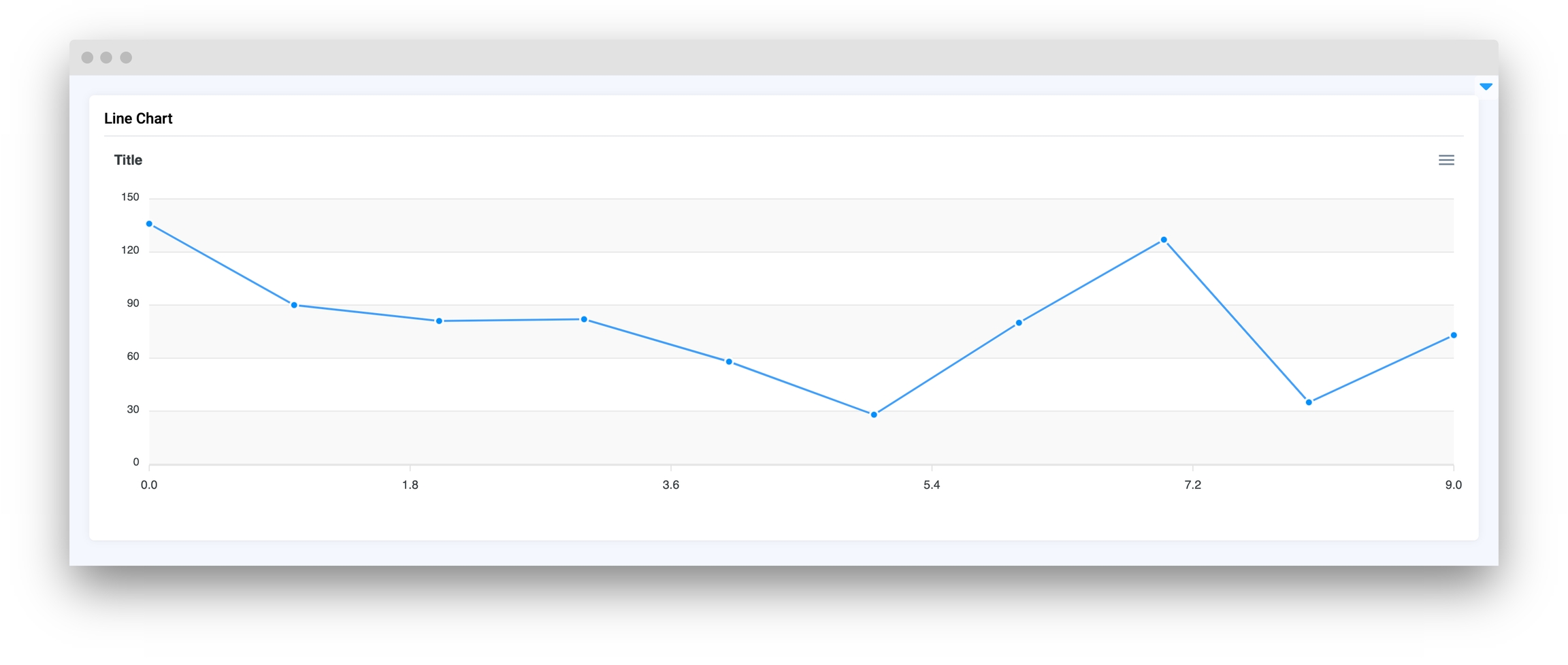
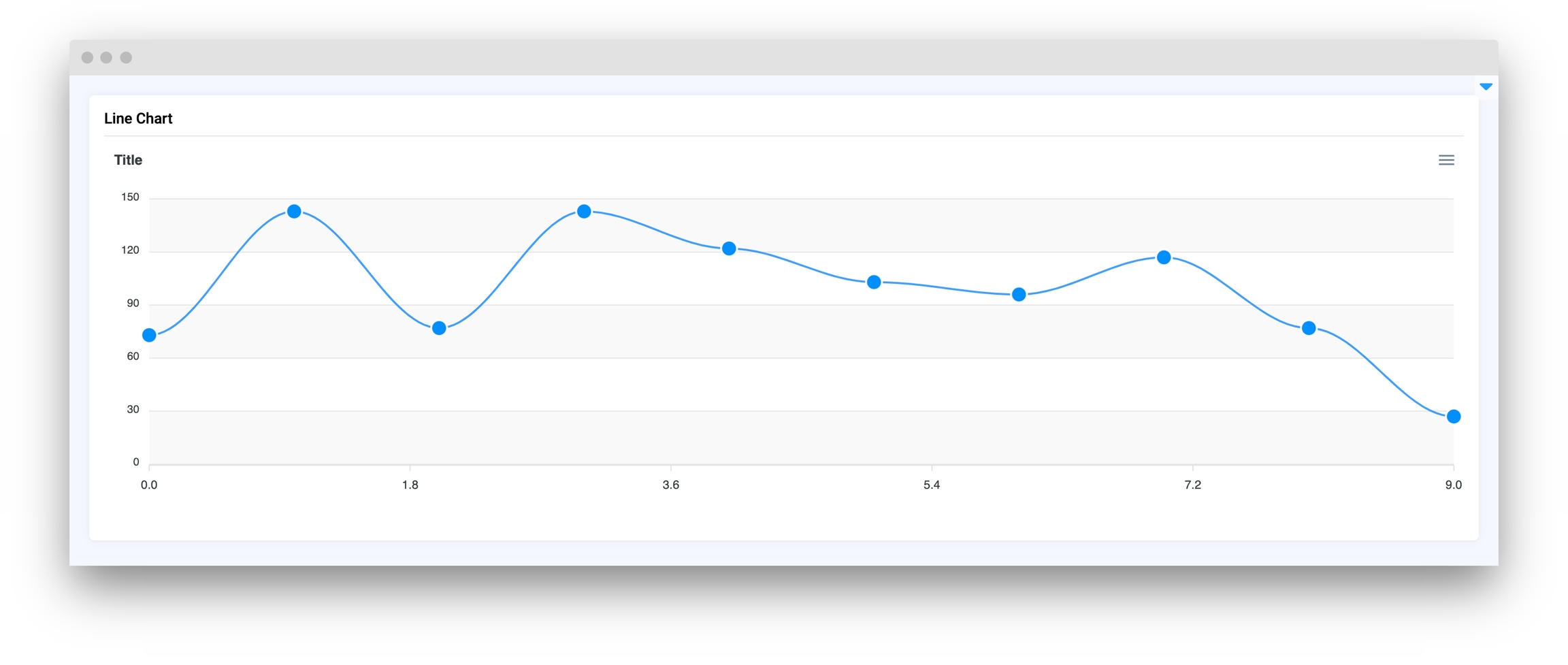
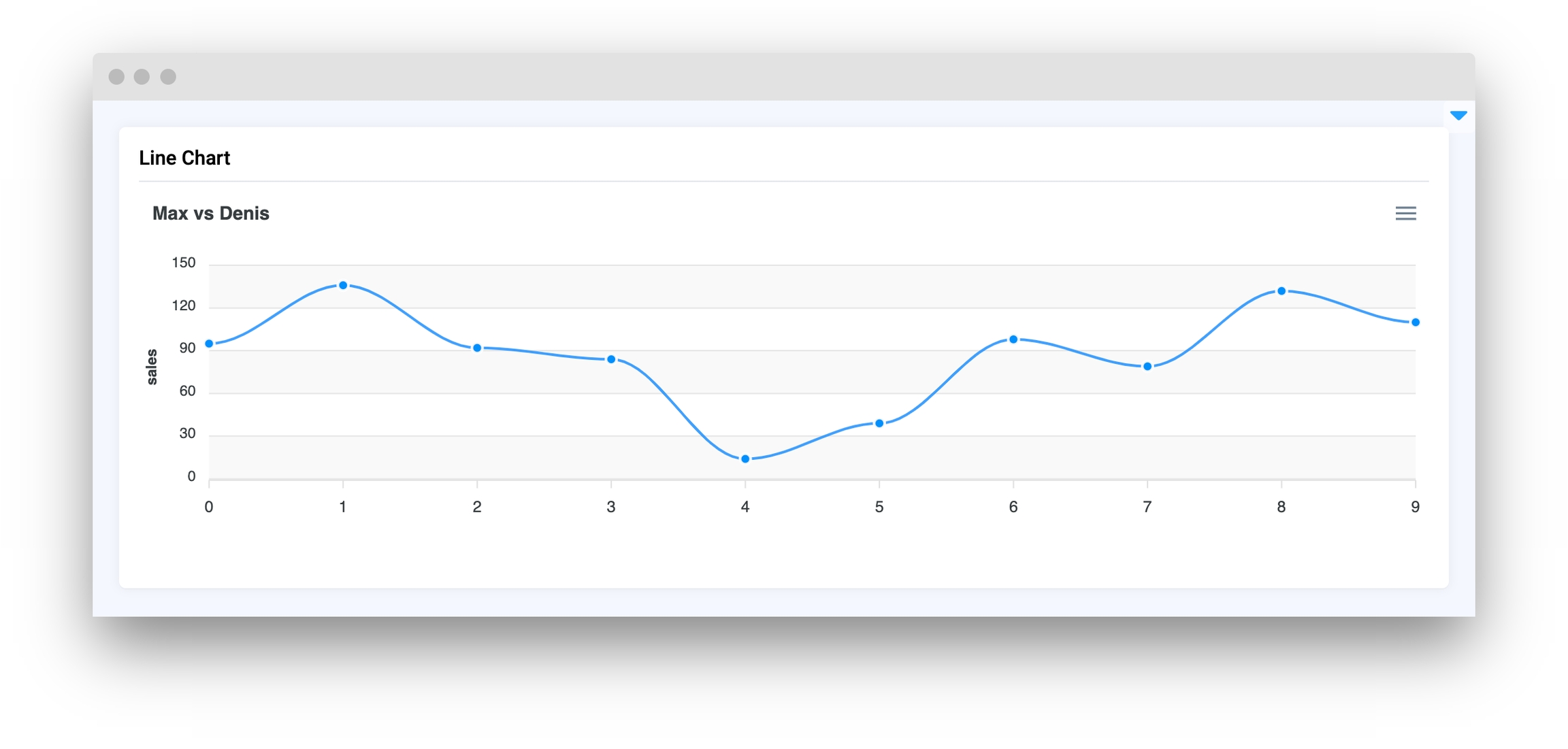
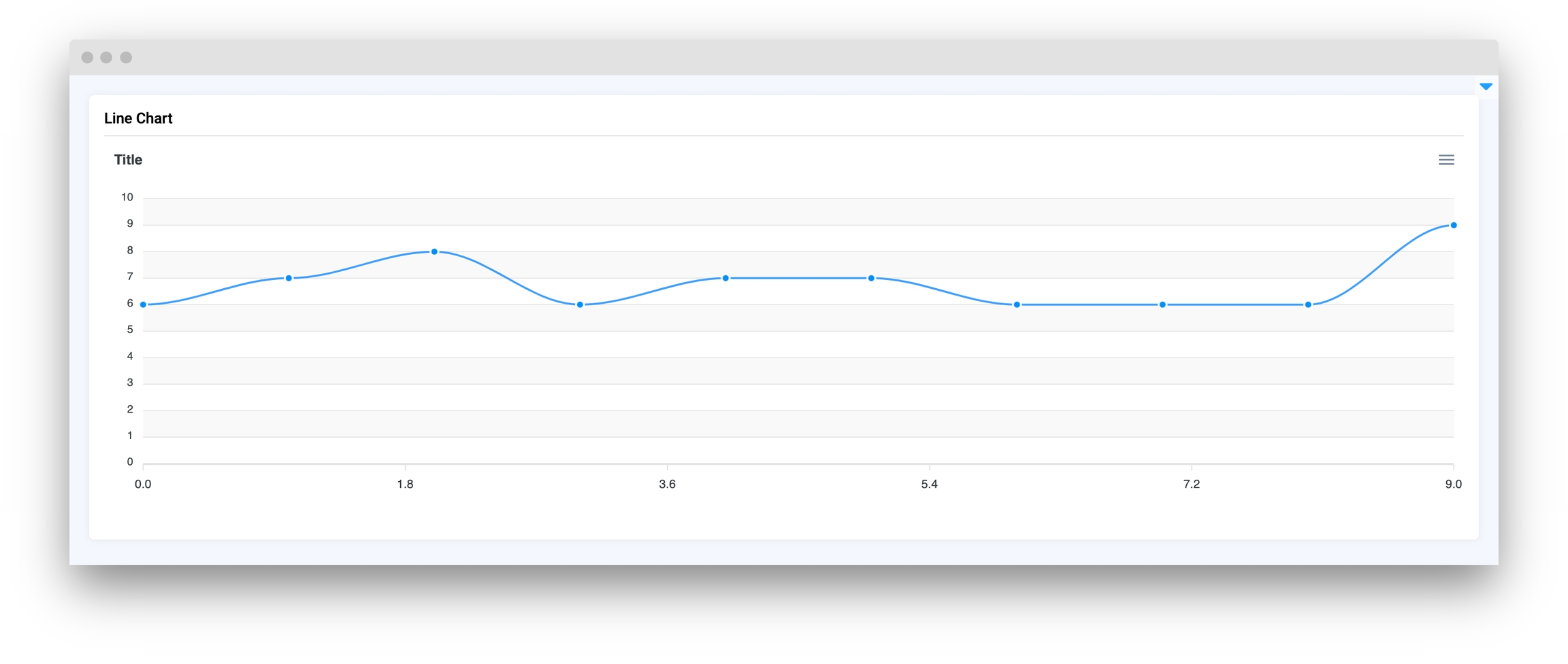
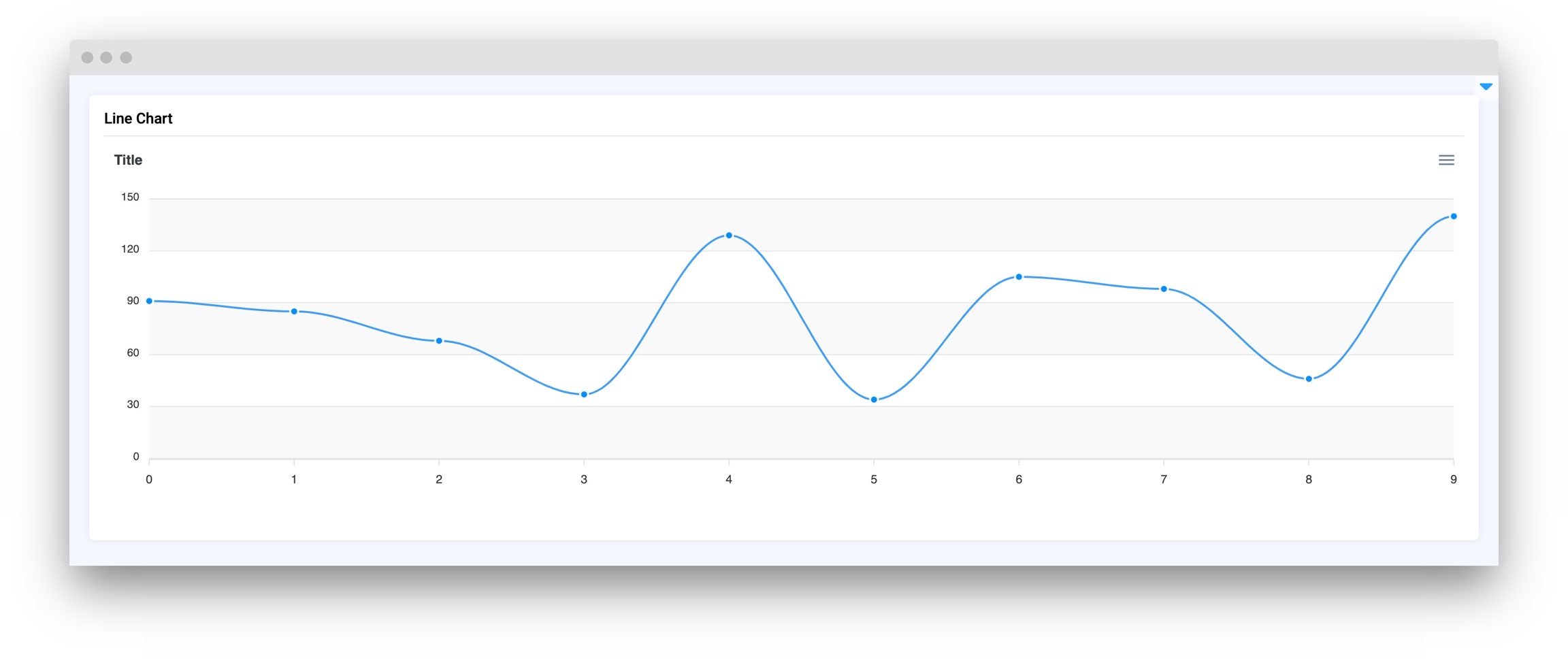
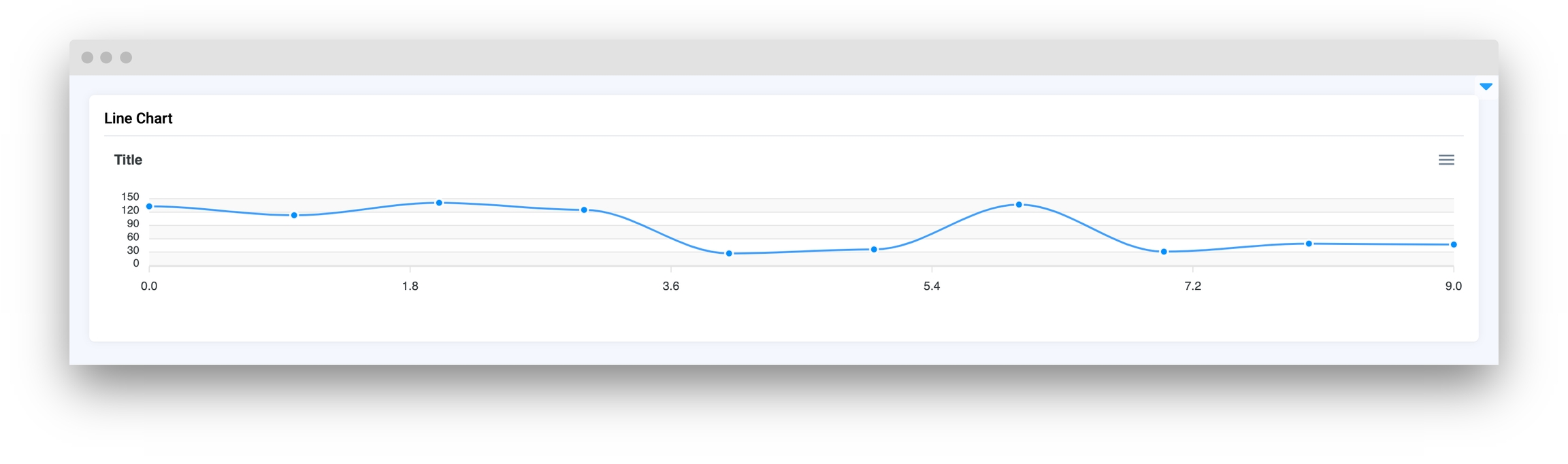
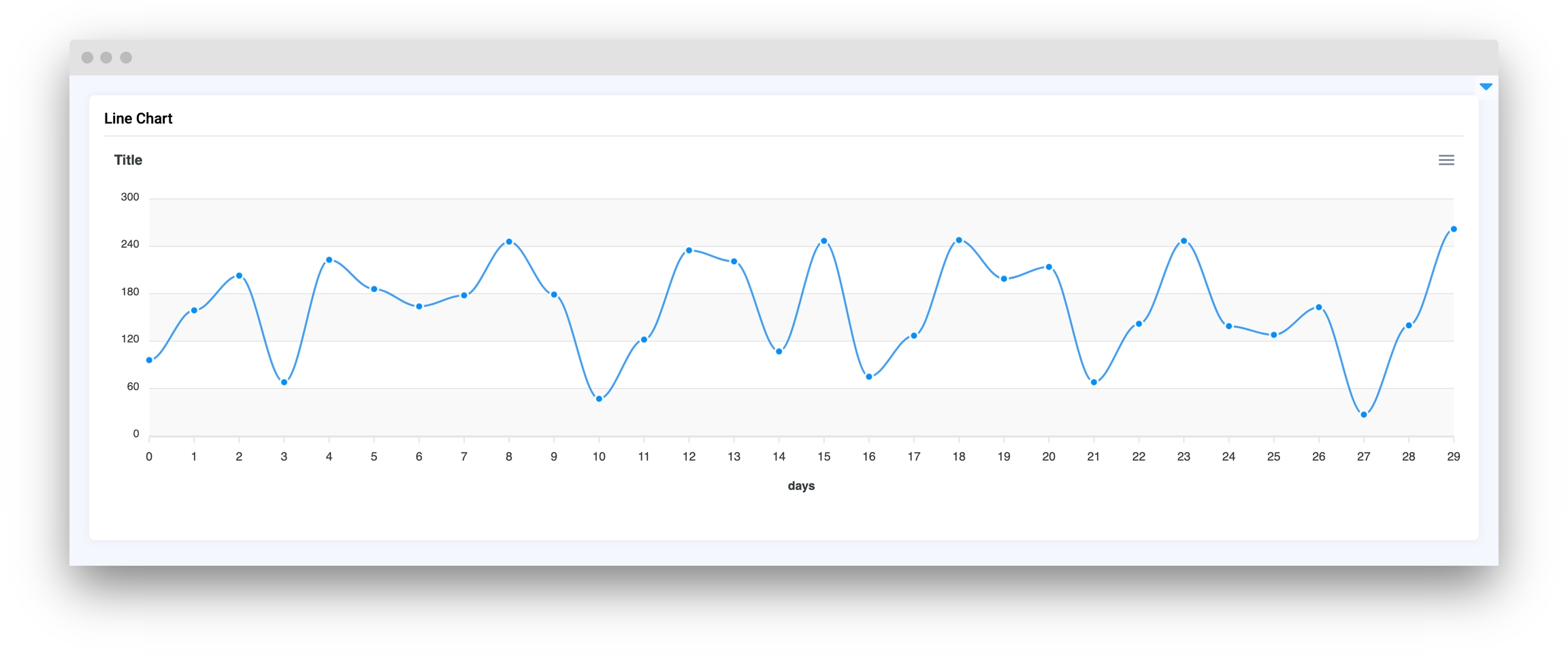
Linechart is a Supervisely widget that allows for visualizing data as a line chart. It supports data in pandas dataframe format or a Python list of dictionaries with a specific structure. This widget could be considered an advanced version of a LinePlot widget with the support of library.
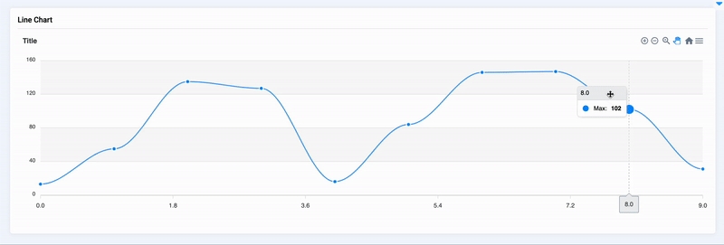
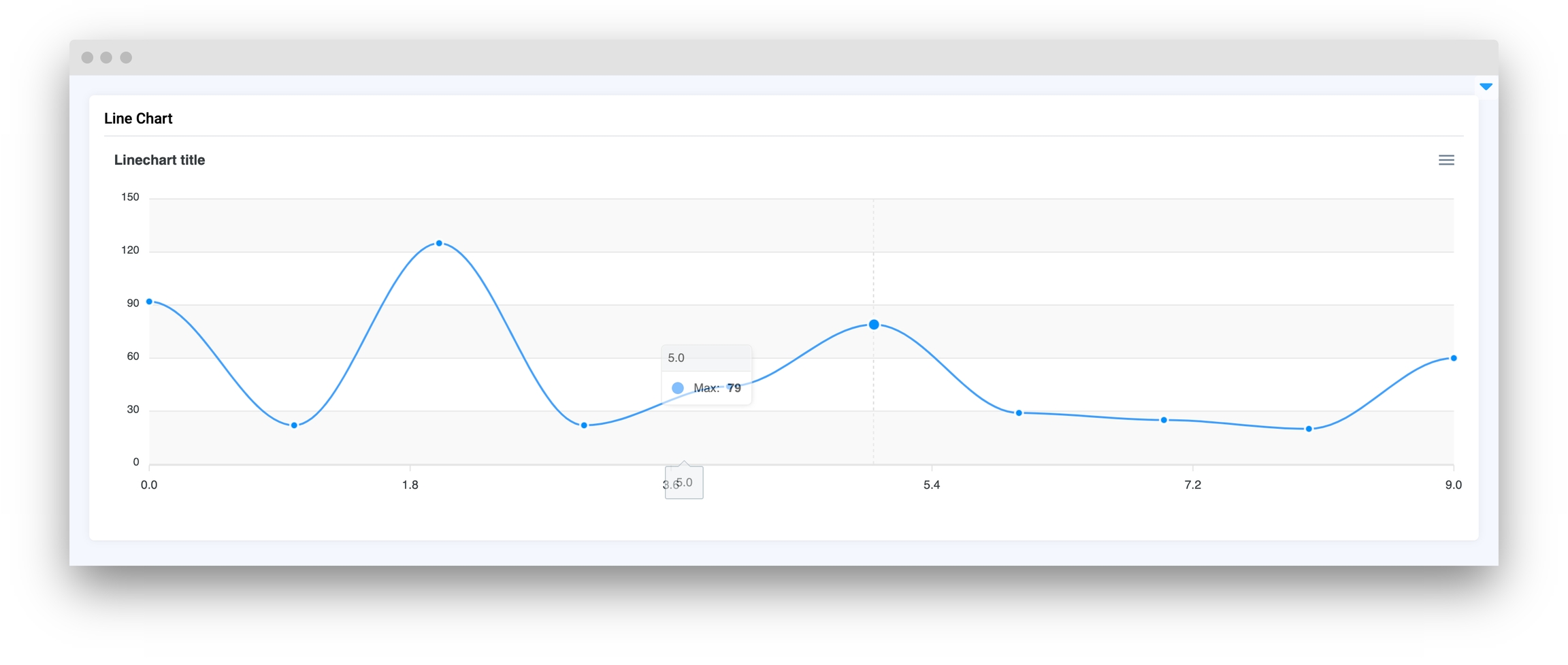
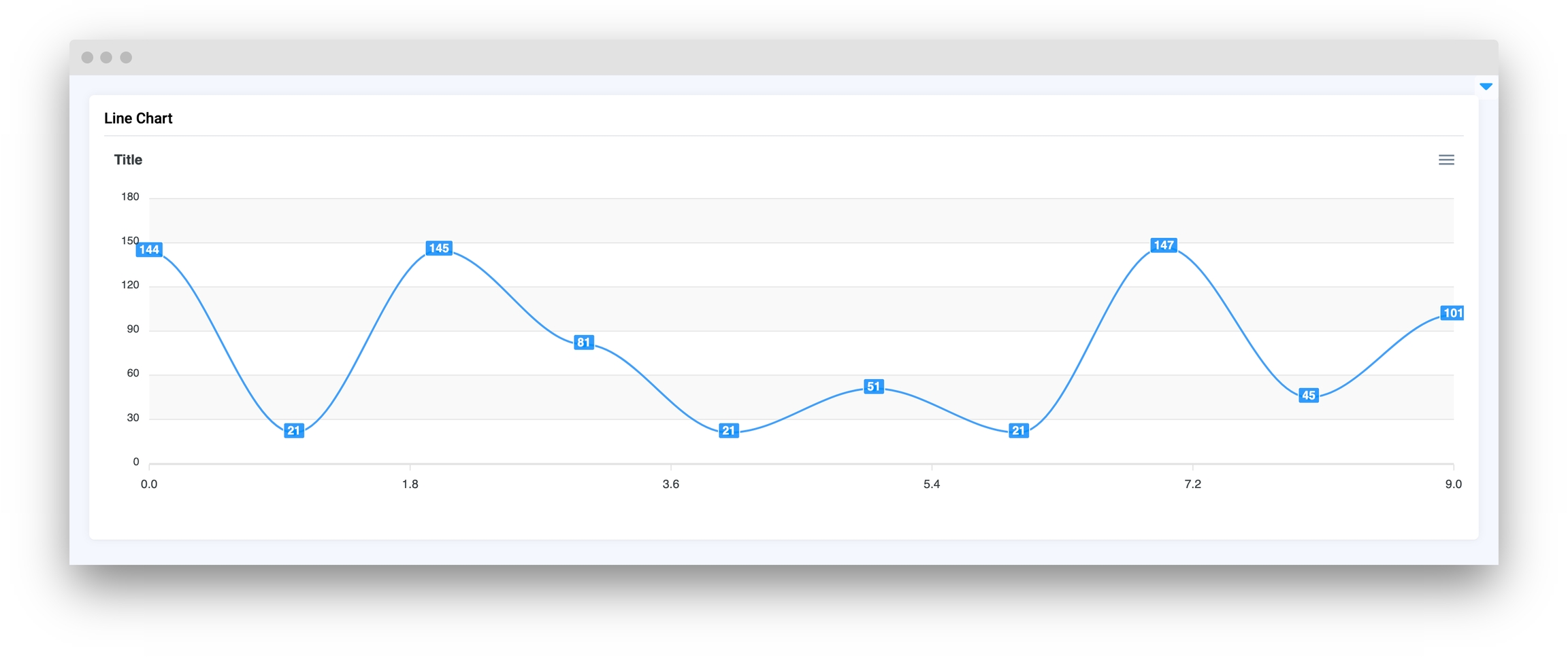
The widget allows for customization of the chart title, axis titles, and color scheme. Linechart also supports zooming, panning, and downloading the chart as png, svg, or csv. Additionally, it can detect clicks on data points and respond to them through Python code
title
str
Line chart title
series
list
List of series including names and lists of X, Y coordinates
zoom
bool
Enable zoom on Linechart
stroke_curve
Literal["smooth", "straight"]
Set line type (straight or curved)
stroke_width
int
Set line width
markers_size
int
Set point markers size
data_labels
bool
If True it will display Y value of data for each datapoint
xaxis_type
Literal["numeric", "category", "datetime"]
Set type of divisions on X axis
xaxis_title
str
Set title for the X axis
yaxis_title
str
Set title for the Y axis
yaxis_autorescale
bool
Set autoscaling of the Y axis
height
Union[int, str]
Widget height
decimalsInFloat
int
Set number of decimals in float values of Y axis
data_type
Literal["dict", "tuple"]
The representation of xy coordinates. Default as a dictionary.
Line chart title
type: str
List of series including names and lists of X, Y coordinates
type: list
Enable zoom on Linechart
type: bool
default False
Set line type (straight or curved)
type: Literal["smooth", "straight"]
default "smooth"
Set line width
type: int
default 2
Set point markers size
type: int
default 4
If True it will display Y value of data for each
type: bool
default False
Set type of divisions on X axis
type: Literal["numeric", "category", "datetime"]
default numeric
Set title for the X axis
type: str
default None
Set title for the Y axis
type: str
default None
Set autoscaling of the Y axis
type: bool
default True
Widget height
type: Union[int, str]
default 350
Set number of decimals in float values of Y axis
type: int
default 2
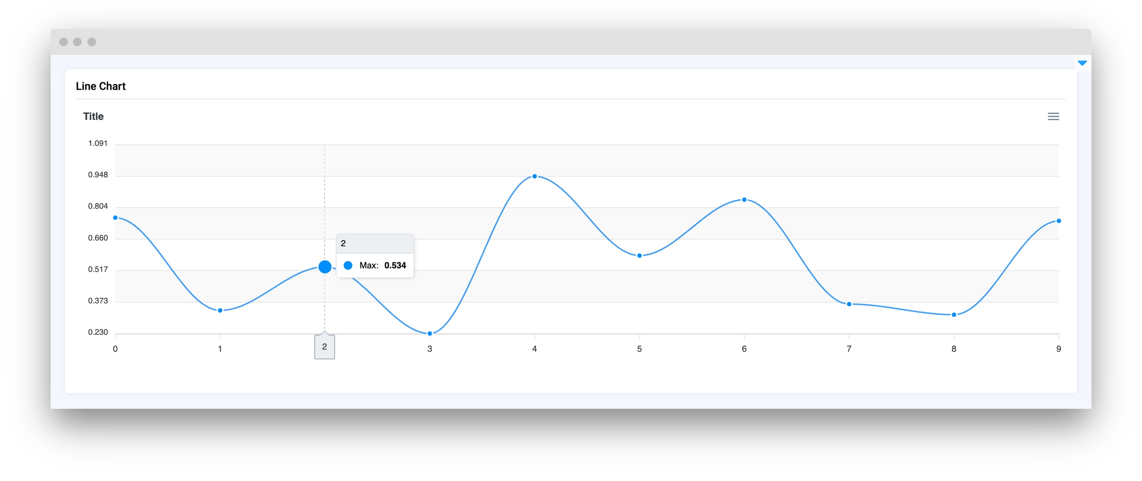
update_y_range(ymin: int, ymax: int, send_changes=True)
Update chart Y axis range.
get_clicked_value()
Get value of clicked datapoint.
get_clicked_datapoint()
Get clicked datapoint.
set_title(title: str, send_changes: bool = True)
Set chart title.
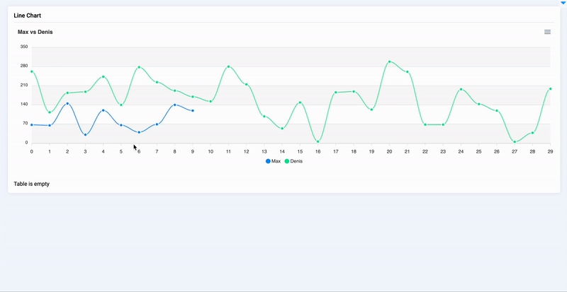
add_series(name: str, x: list, y: list)
Add new series to chart.
add_series_batch(series: dict)
Add batch of series to chart.
set_series(series: list, description: str)
Set series to chart.
set_colors(colors: list, description: str)
Set colors for series in chart.
@click
Decorator function to handle chart click.
You can find this example in our Github repository:
First, we load environment variables with credentials and init API for communicating with Supervisely Instance:
LineChart widgetPrepare a layout for app using Card widget with the content parameter.
Create an app object with layout parameter.