Layouts and Containers
Widgets that help organize content on the screen, like grids, tabs, or sections
Last updated
Was this helpful?
Widgets that help organize content on the screen, like grids, tabs, or sections
Last updated
Was this helpful?
Dialog
Pop-up tool for alerts or user confirmations
Card
Display content or data in a visually appealing and organized way
Container
Serves to group various widgets and elements within a single enclosing space
Empty
Used to insert blank spaces within the user interface to improve layout and spacing
Field
Titled area in the UI, typically used to display data or content associated with the title
Flexbox
Layout that allows for the creation of flexible and responsive container elements to organize widgets
Grid
Enables the addition of a structured menu or other complex layouts to the user interface
Menu
Utilizes a grid layout to organize content and widgets for easy access
One Of
Allows the selection from different content options to be displayed at one time
Sidebar
Provides a hideable sidebar for additional navigation or content in the UI
Stepper
Helps in breaking down a process or workflow into distinct steps for better organization
RadioTabs
Offers a way to switch between different sections of content using tabs that function like radio buttons
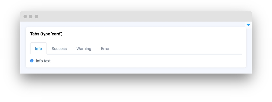
Tabs
Сlickable tabs to make it easier to work with and navigate between various content parts.
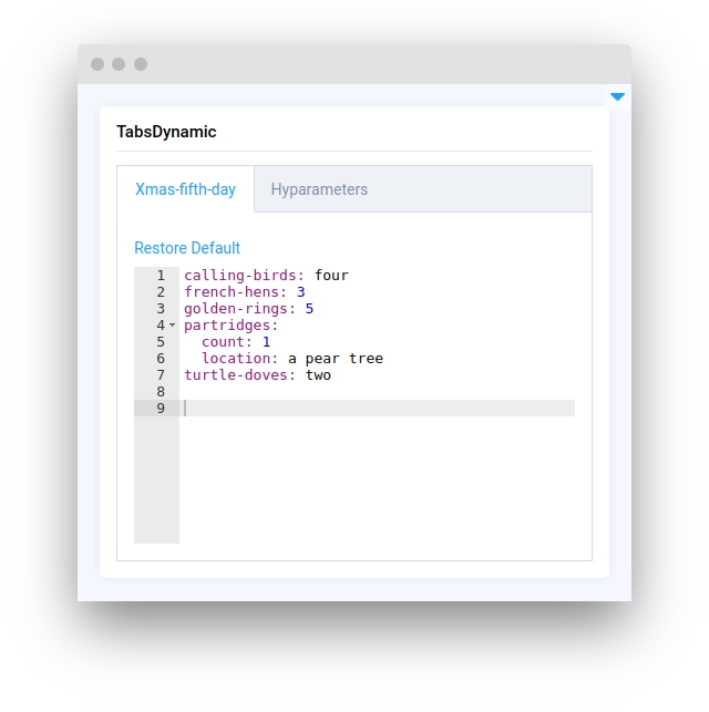
TabsDynamic
This feature allows for the addition of editable tabs, enhancing flexibility and user interaction within the UI
ReloadableArea
Seamlessly create and change widgets within GUI
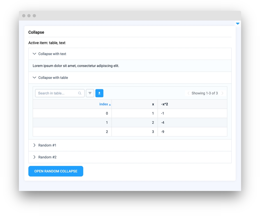
Collapse
Designed to create collapsible regions within the UI, helping to manage space by showing or hiding content as needed
IFrame
Useful for displaying custom html content within your application


