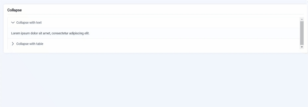
Collapse
Introduction
In this tutorial you will learn how to use Collapse widget in Supervisely app.
Function signature
Parameters
labels
List[str]
Collapses titles. Only distinct values are allowed.
contents
List[Union[str, Widget]]
Collapses content. Raw text or other widgets are possible.
accordion
bool
Whether to activate accordion mode. If true, only one panel could be active.
widget_id
str
Id of the widget
labels
Determine Collapse titles.
type: List[str]
contents
Determine Collapse content.
type: List[Union[str, Widget]]
accordion
Activate accordion mode. If true, only one panel could be active.
type: bool
default value: False
widget_id
ID of the widget.
type: str
default value: None
Methods and attributes
set_active_panel(value: Union[str, List[str]])
Set Collapse active panel. In accordion mode, only strings are permitted.
get_active_panel()
Return name/names of active panel(s).
get_items()
Return panels description.
set_items(value: List[Collapse.Item])
Set Collapse items.
add_items(value: List[Collapse.Item])
Extends list of Collapse items.
Mini App Example
Import libraries
Init API client
First, we load environment variables with credentials and init API for communicating with Supervisely Instance:
Initialize Collapse content and widget
Collapse content and widgetIf no elements are passed during initialization, then the Collapse will contain an empty element by default. To add new elements and delete the default one use set_items funciton.
Create text widget and contol button
This text widget will show the collapse widget's current active item(s).
Create app layout
Prepare a layout for app using Card widget with the content parameter and place widget that we've just created in the Container widget.
Create app using layout
Create an app object with layout parameter.
Update text widget state
collapse.value_changed decorator handle collapse changes and pass active collapse items to show_active_item function.
tbl.click decorator handle table changes (sorting, searching etc.).
button.click decorator handle clicks on button. We use this button to open random collapse.
Last updated
Was this helpful?

