> For the complete documentation index, see [llms.txt](https://developer.supervisely.com/llms.txt). Markdown versions of documentation pages are available by appending `.md` to page URLs; this page is available as [Markdown](https://developer.supervisely.com/app-development/widgets/charts-and-plots/heatmapchart.md).
# HeatmapChart
## Introduction
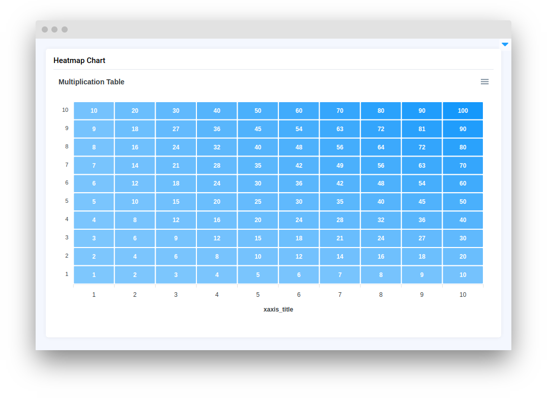
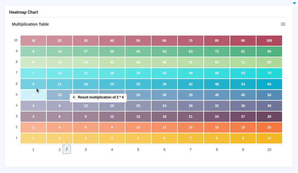
**`HeatmapChart`** widget in Supervisely is a widget used for displaying a heatmap chart. It allows users to visualize data in a way that highlights patterns and trends. Users can hover over each cell to see the data for that cell. The HeatmapChart widget is often used in data analysis and visualization tasks, such as exploring the distribution of object instances in a dataset. `HeatmapChart` allows downloading data series from widget in `svg`, `png`, and `csv` formats.
## Function signature
```python
HeatmapChart(
title="Multiplication Table",
data_labels=True,
xaxis_title=None,
color_range="row",
tooltip=None,
)
```
## Parameters
| Parameters | Type | Description |
| :-----------: | :-----------------------: | :-----------------------------------------------------------------------: |
| `title` | `str` | `HeatmapChart` title |
| `data_labels` | `bool` | Determines whether the values in the `HeatmapChart` cells are displayed |
| `xaxis_title` | `str` | `X` axe title |
| `color_range` | `Literal["table", "row"]` | Determines the color distribution on `HeatmapChart` |
| `tooltip` | `str` | Determines the displayed value in the `HeatmapChart` cells |
### title
Determines `HeatmapChart` title.
**type:** `str`
### data\_labels
Determines whether the values in the `HeatmapChart` cells are displayed.
**type:** `bool`
**default value:** `true`
```python
chart = HeatmapChart(
title="Multiplication Table",
xaxis_title="",
data_labels='False'
color_range="row",
tooltip="Result multiplication of {x} * {series_name}",
)
```
### xaxis\_title
Determines `X` axe title.
**type:** `str`
**default value:** `None`
```python
chart = HeatmapChart(
title="Multiplication Table",
xaxis_title="xaxis_title",
color_range="row",
tooltip="Result multiplication of {x} * {series_name}",
)
```
### color\_range
Determines the color distribution on `HeatmapChart`.
**type:** `Literal["table", "row"]`
**default value:** `row`
```python
chart = HeatmapChart(
title="Multiplication Table",
xaxis_title="xaxis_title",
color_range="table",
tooltip="Result multiplication of {x} * {series_name}",
)
```
## tooltip
Determines the displayed value in the `HeatmapChart` cells.
**type:** `str`
**default value:** `None`
```python
chart = HeatmapChart(
title="Multiplication Table",
tooltip="Result multiplication of {x} * {series_name}",
)
```
## Methods and attributes
| Attributes and Methods | Description |
| :----------------------------------------------------------: | ----------------------------------------------------------- |
| `add_series_batch(series: dict)` | Add batch of series to chart. |
| `add_series(name: str, x: list, y: list, send_changes=True)` | Add series of data in `HeatmapChart`. |
| `get_clicked_datapoint()` | Return data clicked in `HeatmapChart`. |
| `get_clicked_value()` | Return `seriesIndex` nad `dataPointIndex` for clicked cell. |
| `set_colors(colors: list)` | Set colors for series in chart. |
| `set_title(title: str)` | Set chart title. |
| `@click` | Decorator function is handled when chart cell is clicked. |
## Mini App Example
You can find this example in our Github repository:
[ui-widgets-demos/charts and plots/002\_heatmap\_chart/src/main.py](https://github.com/supervisely-ecosystem/ui-widgets-demos/blob/master/charts%20and%20plots/002_heatmap_chart/src/main.py)
### Import libraries
```python
import os
import supervisely as sly
from dotenv import load_dotenv
from supervisely.app.widgets import Card, Container, HeatmapChart
```
### Init API client
First, we load environment variables with credentials and init API for communicating with Supervisely Instance:
```python
load_dotenv("local.env")
load_dotenv(os.path.expanduser("~/supervisely.env"))
api = sly.Api()
```
### Initialize function to build example chart
```python
def multiplication_chart():
data = []
for row in list(range(1, 11)):
temp = [round(row * number, 1) for number in list(range(1, 11))]
data.append(temp)
return data
```
### Initialize `HeatmapChart` widget
```python
chart = HeatmapChart(
title="Multiplication Table",
xaxis_title="",
color_range="row",
tooltip="Result multiplication of {x} * {series_name}",
)
```
### Add data to `HeatmapChart` widget
```python
data = multiplication_chart()
lines = [
{"name": idx + 1, "x": list(range(1, 11)), "y": line}
for idx, line in enumerate(data)
]
chart.add_series_batch(lines)
```
### Create app layout
Prepare a layout for app using `Card` widget with the `content` parameter and place widget that we've just created in the `Container` widget.
```python
card = Card(
title="Heatmap Chart",
content=Container([chart, text]),
)
layout = Container(widgets=[card])
```
### Create app using layout
Create an app object with layout parameter.
```python
app = sly.Application(layout=layout)
```