> For the complete documentation index, see [llms.txt](https://developer.supervisely.com/llms.txt). Markdown versions of documentation pages are available by appending `.md` to page URLs; this page is available as [Markdown](https://developer.supervisely.com/app-development/widgets/charts-and-plots/scatterchart.md).
# ScatterChart
## Introduction
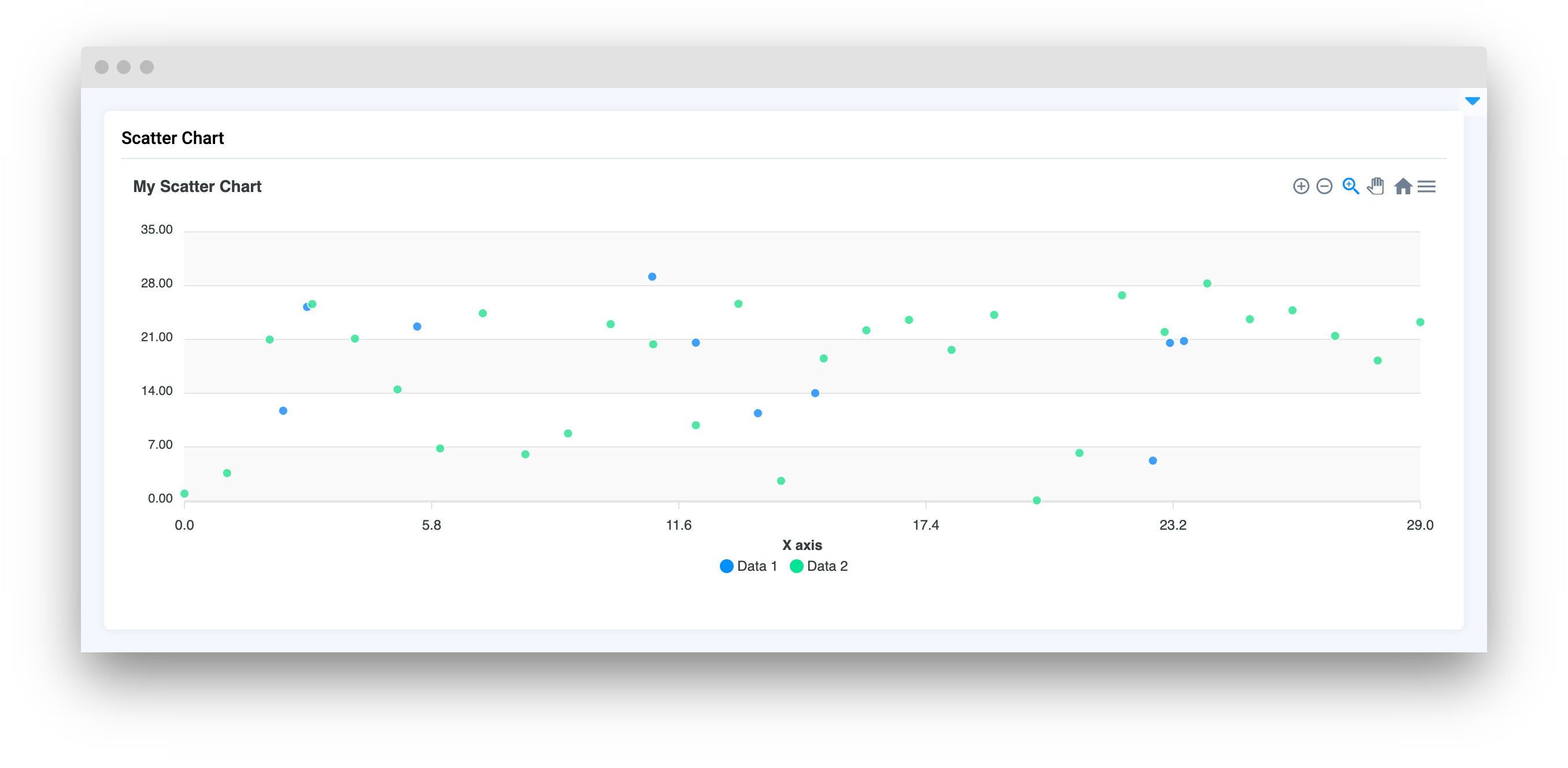
**`ScatterChart`** is a widget in Supervisely used to display a scatter plot of numerical data. It can be used to visualize the relationship between two variables in a dataset, with each point on the plot representing a data point in the dataset. It is commonly used in data exploration and analysis tasks.
## Function signature
```python
x1 = list(range(10))
y1 = [random.randint(6, 15) for _ in range(10)]
x2 = list(range(30))
y2 = [random.randint(0, 30) for _ in range(30)]
scatter_chart = ScatterChart("My Scatter Chart")
scatter_chart.add_series("Data 1", x1, y1)
scatter_chart.add_series("Data 2", x2, y2)
```
or
```python
size1 = 10
xy = np.random.normal(15, 6, (size1, 2)).tolist()
s1 = [{"x": x, "y": y} for x, y in xy]
size2 = 30
x2 = list(range(size2))
y2 = np.random.uniform(low=0, high=30, size=size2).tolist()
s2 = [{"x": x, "y": y} for x, y in zip(x2, y2)]
scatter_chart = ScatterChart(
title="My Scatter Chart",
series=[{"name": "Data 1", "data": s1}, {"name": "Data 2", "data": s2}],
xaxis_type="numeric",
)
```
## Parameters
| Parameters | Type | Description |
| :-----------------: | :------------------------------------------: | :------------------------------------------------------------: |
| `title` | `str` | `ScatterChart` title |
| `series` | `list` | List of input data series |
| `zoom` | `bool` | Enable zoom on |
| `markers_size` | `int` | Set point markers size |
| `data_labels` | `bool` | If `True` it will display `Y` value of data for each datapoint |
| `xaxis_type` | `Literal["numeric", "category", "datetime"]` | Set type of divisions on `X` axis |
| `xaxis_title` | `str` | Set title for the `X` axis |
| `yaxis_title` | `str` | Set title for the `Y` axis |
| `yaxis_autorescale` | `bool` | Set autoscaling of the `Y` axis |
| `height` | `Union[int, str]` | Widget height |
| `decimalsInFloat` | `int` | Set number of decimals in float values of `Y` axis |
| `widget_id` | `str` | ID of the widget |
### title
Chart title
**type:** `str`
### series
List of input data series
**type:** `list`
```python
scatter_chart = ScatterChart(
title="My Scatter Chart",
series=[{"name": "Data 1", "data": s1}, {"name": "Data 2", "data": s2}],
)
```
### zoom
Enable zoom on
**type:** `bool`
```python
scatter_chart_1 = ScatterChart(
title="My Scatter Chart",
series=[{"name": "Data 1", "data": s1}, {"name": "Data 2", "data": s2}],
zoom=True
)
scatter_chart_2 = ScatterChart(
title="My Scatter Chart",
series=[{"name": "Data 1", "data": s1}, {"name": "Data 2", "data": s2}],
zoom=False
)
```
### markers\_size
Set point markers size
**type:** `int`
```python
scatter_chart = ScatterChart(
title="My Scatter Chart",
series=[{"name": "Data 1", "data": s1}, {"name": "Data 2", "data": s2}],
markers_size=8,
)
```
### data\_labels
If `True` it will display `Y` value of data for each datapoint
**type:** `bool`
```python
scatter_chart = ScatterChart(
title="My Scatter Chart",
series=[{"name": "Data 1", "data": s1}, {"name": "Data 2", "data": s2}],
data_labels=True,
)
```
### xaxis\_type
Set type of divisions on `X` axis
**type:** `Literal["numeric", "category", "datetime"]`
```python
scatter_chart = ScatterChart(
title="My Scatter Chart",
series=[{"name": "Data 1", "data": s1}, {"name": "Data 2", "data": s2}],
xaxis_type="category",
)
```
### xaxis\_title
Set title for the `X` axis
**type:** `str`
```python
scatter_chart = ScatterChart(
title="My Scatter Chart",
series=[{"name": "Data 1", "data": s1}, {"name": "Data 2", "data": s2}],
xaxis_title="X axis",
)
```
### yaxis\_title
Set title for the `Y` axis
**type:** `str`
```python
scatter_chart = ScatterChart(
title="My Scatter Chart",
series=[{"name": "Data 1", "data": s1}, {"name": "Data 2", "data": s2}],
yaxis_title="Y axis",
)
```
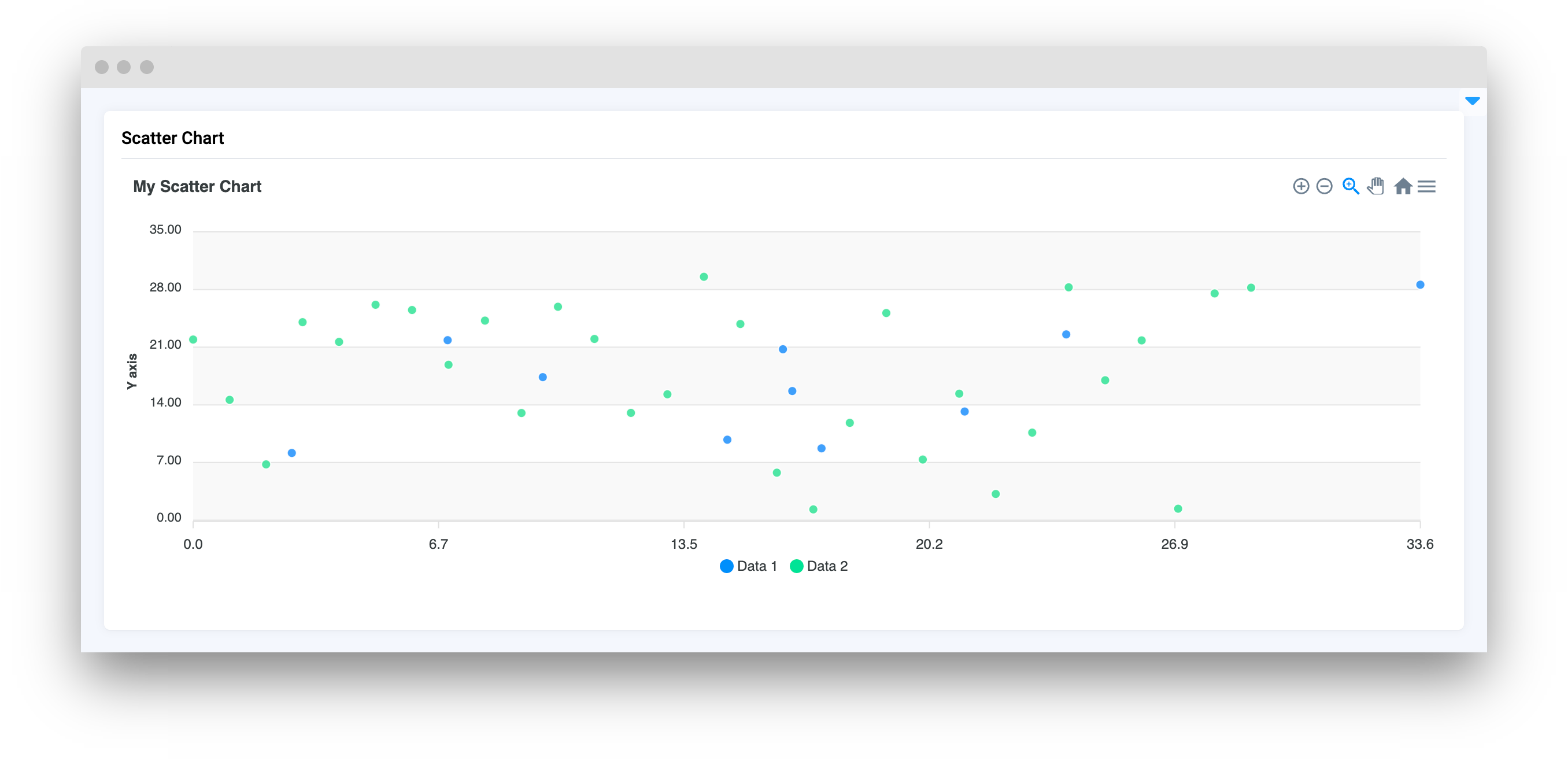
### yaxis\_autorescale
Set autoscaling of the `Y` axis
**type:** `bool`
```python
scatter_chart = ScatterChart(
title="My Scatter Chart",
series=[{"name": "Data 1", "data": s1}, {"name": "Data 2", "data": s2}],
yaxis_autorescale=False,
)
```
### height
Widget height
**type:** `Union[int, str]`
```python
scatter_chart = ScatterChart(
title="My Scatter Chart",
series=[{"name": "Data 1", "data": s1}, {"name": "Data 2", "data": s2}],
height=200,
)
```
### decimalsInFloat
Set number of decimals in float values of `Y` axis
**type:** `int`
```python
scatter_chart = ScatterChart(
title="My Scatter Chart",
series=[{"name": "Data 1", "data": s1}, {"name": "Data 2", "data": s2}],
decimalsInFloat=4,
)
```
### widget\_id
ID of the widget.
**type:** `str`
**default value:** `None`
## Methods and attributes
| Attributes and Methods | Description |
| :------------------------------------------------------------------------: | -------------------------------------------------- |
| `update_y_range(ymin: int, ymax: int)` | Update chart `Y` axis range. |
| `add_series(name: str, x: list, y: list)` | Add new series of data in `ScatterChart`. |
| `add_series_batch(series: dict)` | Add new series of data in `ScatterChart` by batch. |
| `add_points_to_serie(name: str, x: Union[list, int], y: Union[list, int])` | Add points to series . |
## Mini App Example
You can find this example in our Github repository:
[ui-widgets-demos/charts and plots/007\_scatter\_chart/src/main.py](https://github.com/supervisely-ecosystem/ui-widgets-demos/blob/master/charts%20and%20plots/007_scatter_chart/src/main.py)
### Import libraries
```python
import os
import numpy as np
import supervisely as sly
from supervisely.app.widgets import Card, Container, Text, ScatterChart
from dotenv import load_dotenv
```
#### Init API client
First, we load environment variables with credentials and init API for communicating with Supervisely Instance:
```python
load_dotenv("local.env")
load_dotenv(os.path.expanduser("~/supervisely.env"))
api = sly.Api()
```
### Prepare series for chart
```python
size1 = 10
xy = np.random.normal(15, 6, (size1, 2)).tolist()
s1 = [{"x": x, "y": y} for x, y in xy]
size2 = 30
x2 = list(range(size2))
y2 = np.random.uniform(low=0, high=30, size=size2).tolist()
s2 = [{"x": x, "y": y} for x, y in zip(x2, y2)]
```
### Initialize `ScatterChart` widget
```python
scatter_chart = ScatterChart(
title="Max vs Denis",
series=[{"name": "Max", "data": s1}, {"name": "Denis", "data": s2}],
xaxis_type="numeric",
)
```
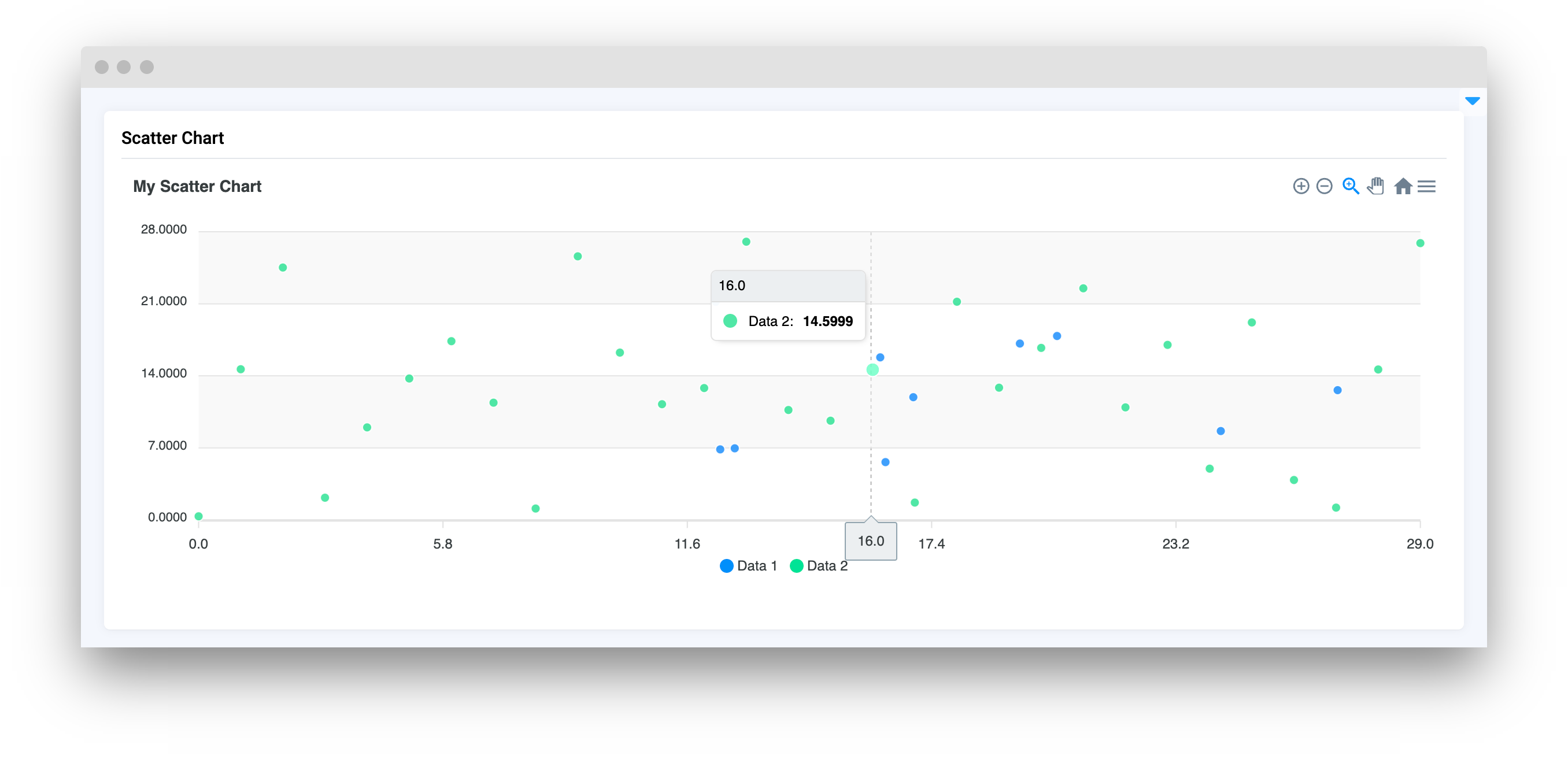
### Create `Text` widget
```python
text = Text("Try clicking on point!")
```
### Create app layout
Prepare a layout for the app using `Card` widget with the `content` parameter and place the widget that we've just created in the `Container` widget.
```python
layout = Container([scatter_chart, text])
card = Card(title="Scatter Chart", content=layout)
```
### Create app using layout
Create an app object with layout parameter.
```python
app = sly.Application(layout=layout)
```
### Add functions to control widgets from code
```python
@scatter_chart.click
def on_click(datapoint: ScatterChart.ClickedDataPoint):
print(f"Line: {datapoint.series_name}")
print(f"x = {datapoint.x}")
print(f"y = {datapoint.y}")
text.set(f"x = {round(datapoint.x, 4)}, y = {round(datapoint.y, 4)}", "info")
scatter_chart.add_points_to_serie("Max", [51, 52], [51, 52])
scatter_chart.add_points_to_serie("Denis", 59, 40)
```