> For the complete documentation index, see [llms.txt](https://developer.supervisely.com/llms.txt). Markdown versions of documentation pages are available by appending `.md` to page URLs; this page is available as [Markdown](https://developer.supervisely.com/app-development/widgets/charts-and-plots/apexchart.md).
# ApexChart
## Introduction
**`Apexchart`** is a widget in Supervisely that allows for displaying interactive charts on the UI. It supports various chart types such as `line`, `area`, and `bar`. Users can customize the chart by changing the chart type, color schemes, and legend location.
It also provides functionality for data streaming and dynamic updates, allowing the chart to display real-time data. The data can be passed to the chart in the form of a pandas dataframe or a Python list of dictionaries. Additionally, users can control the chart through Python code by detecting events such as clicking on a data point or hovering over a chart element.
## Function signature
```python
size1 = 10
x1 = list(range(size1))
y1 = np.random.randint(low=10, high=148, size=size1).tolist()
s1 = [{"x": x, "y": y} for x, y in zip(x1, y1)]
size2 = 30
x2 = list(range(size2))
y2 = np.random.randint(low=0, high=300, size=size2).tolist()
s2 = [{"x": x, "y": y} for x, y in zip(x2, y2)]
apexchart = Apexchart(
series=[{"name": "Max", "data": s1}, {"name": "Denis", "data": s2}],
options={
"chart": {"type": "line", "zoom": {"enabled": False}},
"dataLabels": {"enabled": False},
"stroke": {"curve": "smooth", "width": 2},
"title": {"text": "Product Trends by Month", "align": "left"},
"grid": {"row": {"colors": ["#f3f3f3", "transparent"], "opacity": 0.5}},
"xaxis": {"type": "category"},
},
type="line",
)
```
 ## Parameters
| Parameters | Type | Description |
| :-----------: | :---------------: | :----------------------------------------------------------: |
| `series` | `list` | List of series including names and lists of X, Y coordinates |
| `options` | `dict` | Chart options for customizing styles |
| `type` | `str` | Type of chart (`line`, `bar`, `area`) |
| `height` | `Union[int, str]` | Widget height |
| `sly_options` | `dict` | Additional options used in supervisely component |
### series
List of series including names and lists of X, Y coordinates
**type:** `list`
```python
apexchart = Apexchart(
series=[{"name": "Max", "data": s1}, {"name": "Denis", "data": s2}],
# options=...
# type=...
)
```
### options
Chart options for customizing styles
**type:** `dict`
```python
apexchart = Apexchart(
options={
"chart": {"type": "line", "zoom": {"enabled": False}},
"dataLabels": {"enabled": False},
"stroke": {"curve": "smooth", "width": 2},
"title": {"text": "Product Trends by Month", "align": "left"},
"grid": {"row": {"colors": ["#f3f3f3", "transparent"], "opacity": 0.5}},
"xaxis": {"type": "category"},
},
# series=...,
# type=...
)
```
### type
Type of chart. It supports following chart types: line, area, bar.
**type:** `str`
```python
apexchart = Apexchart(
series=[{"name": "Max", "data": s1}, {"name": "Denis", "data": s2}],
options={
"chart": {"type": "line", "zoom": {"enabled": False}},
"dataLabels": {"enabled": False},
"stroke": {"curve": "smooth", "width": 2},
"title": {"text": "Product Trends by Month", "align": "left"},
"grid": {"row": {"colors": ["#f3f3f3", "transparent"], "opacity": 0.5}},
"xaxis": {"type": "category"},
},
type="line",
)
```
## Parameters
| Parameters | Type | Description |
| :-----------: | :---------------: | :----------------------------------------------------------: |
| `series` | `list` | List of series including names and lists of X, Y coordinates |
| `options` | `dict` | Chart options for customizing styles |
| `type` | `str` | Type of chart (`line`, `bar`, `area`) |
| `height` | `Union[int, str]` | Widget height |
| `sly_options` | `dict` | Additional options used in supervisely component |
### series
List of series including names and lists of X, Y coordinates
**type:** `list`
```python
apexchart = Apexchart(
series=[{"name": "Max", "data": s1}, {"name": "Denis", "data": s2}],
# options=...
# type=...
)
```
### options
Chart options for customizing styles
**type:** `dict`
```python
apexchart = Apexchart(
options={
"chart": {"type": "line", "zoom": {"enabled": False}},
"dataLabels": {"enabled": False},
"stroke": {"curve": "smooth", "width": 2},
"title": {"text": "Product Trends by Month", "align": "left"},
"grid": {"row": {"colors": ["#f3f3f3", "transparent"], "opacity": 0.5}},
"xaxis": {"type": "category"},
},
# series=...,
# type=...
)
```
### type
Type of chart. It supports following chart types: line, area, bar.
**type:** `str`
```python
apexchart = Apexchart(
series=[{"name": "Max", "data": s1}, {"name": "Denis", "data": s2}],
options={
"chart": {"type": "line", "zoom": {"enabled": False}},
"dataLabels": {"enabled": False},
"stroke": {"curve": "smooth", "width": 2},
"title": {"text": "Product Trends by Month", "align": "left"},
"grid": {"row": {"colors": ["#f3f3f3", "transparent"], "opacity": 0.5}},
"xaxis": {"type": "category"},
},
type="line",
)
```
 ```python
apexchart = Apexchart(
series=[{"name": "Max", "data": s1}, {"name": "Denis", "data": s2}],
options={
"chart": {"type": "line", "zoom": {"enabled": False}},
"dataLabels": {"enabled": False},
"stroke": {"curve": "smooth", "width": 2},
"title": {"text": "Product Trends by Month", "align": "left"},
"grid": {"row": {"colors": ["#f3f3f3", "transparent"], "opacity": 0.5}},
"xaxis": {"type": "category"},
},
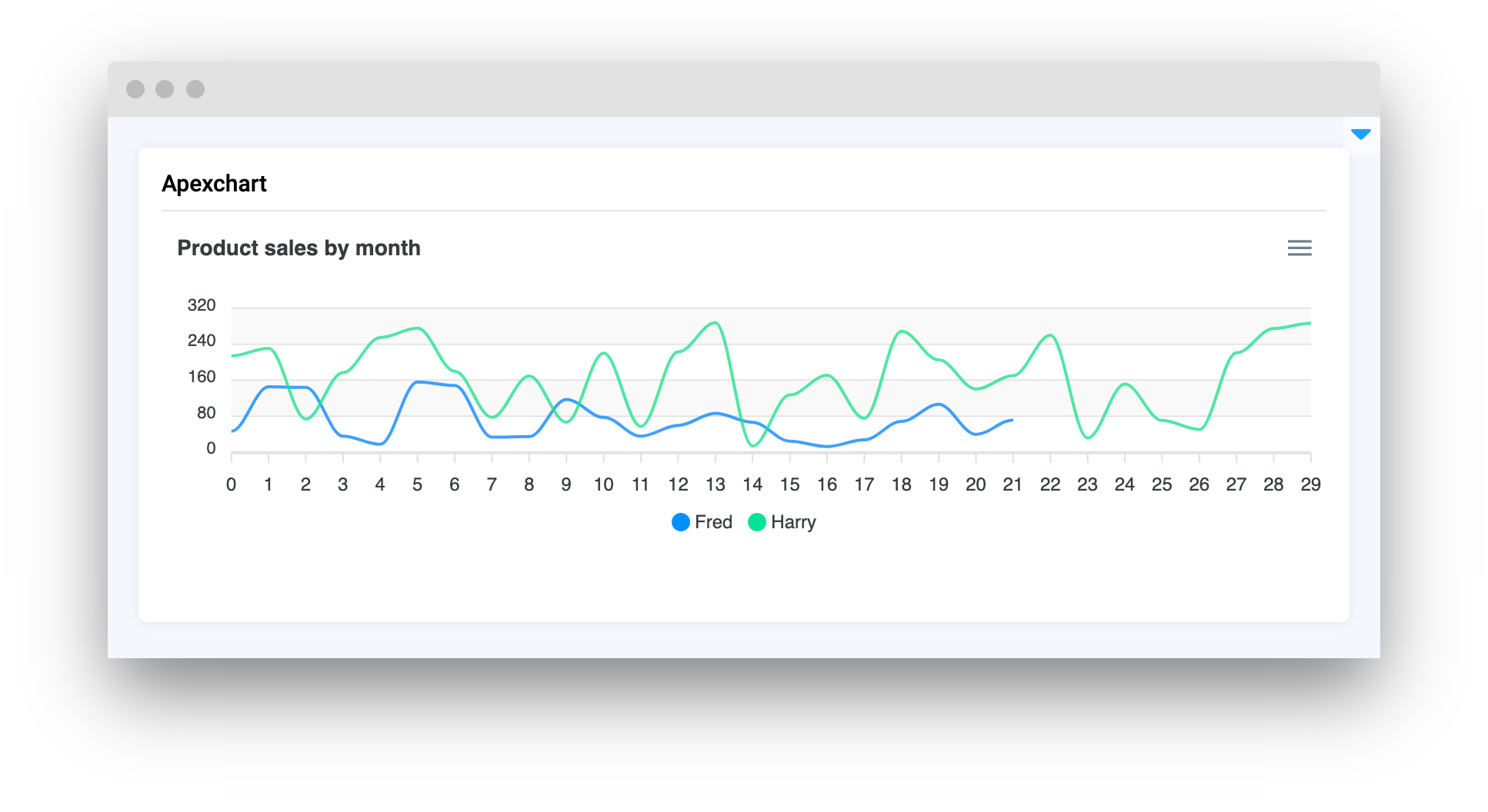
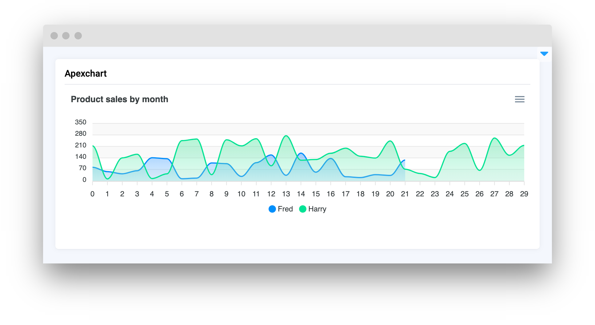
type="area",
)
```
```python
apexchart = Apexchart(
series=[{"name": "Max", "data": s1}, {"name": "Denis", "data": s2}],
options={
"chart": {"type": "line", "zoom": {"enabled": False}},
"dataLabels": {"enabled": False},
"stroke": {"curve": "smooth", "width": 2},
"title": {"text": "Product Trends by Month", "align": "left"},
"grid": {"row": {"colors": ["#f3f3f3", "transparent"], "opacity": 0.5}},
"xaxis": {"type": "category"},
},
type="area",
)
```
 ```python
apexchart = Apexchart(
series=[{"name": "Max", "data": s1}, {"name": "Denis", "data": s2}],
options={
"chart": {"type": "line", "zoom": {"enabled": False}},
"dataLabels": {"enabled": False},
"stroke": {"curve": "smooth", "width": 2},
"title": {"text": "Product Trends by Month", "align": "left"},
"grid": {"row": {"colors": ["#f3f3f3", "transparent"], "opacity": 0.5}},
"xaxis": {"type": "category"},
},
type="bar",
)
```
```python
apexchart = Apexchart(
series=[{"name": "Max", "data": s1}, {"name": "Denis", "data": s2}],
options={
"chart": {"type": "line", "zoom": {"enabled": False}},
"dataLabels": {"enabled": False},
"stroke": {"curve": "smooth", "width": 2},
"title": {"text": "Product Trends by Month", "align": "left"},
"grid": {"row": {"colors": ["#f3f3f3", "transparent"], "opacity": 0.5}},
"xaxis": {"type": "category"},
},
type="bar",
)
```
 ### height
Widget height
**type:** `Union[int, str]`
**default value:** `"300"`
```python
apexchart = Apexchart(
# series=...,
# options=...,
# type=...,
height="500"
)
```
### sly\_options
Additional options used in supervisely component.
**type:** `dict`
## Methods and attributes
| Attributes and Methods | Description |
| :-------------------------------------------------------------------------------------------------------------------: | ------------------------------------------------- |
| `get_clicked_value()` | Get value of clicked datapoint. |
| `get_clicked_datapoint()` | Get clicked datapoint. |
| `set_title(title: str, send_changes: bool = True)` | Set chart title. |
| `add_series(name: str, x: list, y: list, send_changes: bool = True)` | Add new series to chart. |
| `set_series(series: list, send_changes: bool = True)` | Set series to chart. |
| `set_colors(colors: List[str or List[int]], send_changes: bool = True)` | Set colors for series in chart (str, RGB or HEX). |
| `add_to_series(name_or_id: str or int, data: List[tuple] or List[dict] or tuple or dict], send_changes: bool = True)` | Add data to exist series. |
| `get_series_by_name(name: str)` | Return series data by name. |
| `@click` | Decorator function to handle chart click. |
## Mini App Example
You can find this example in our GitHub repository:
[ui-widgets-demos/charts and plots/003\_apex\_chart/src/main.py](https://github.com/supervisely-ecosystem/ui-widgets-demos/blob/master/charts%20and%20plots/003_apex_chart/src/main.py)
### Import libraries
```python
import os
import numpy as np
import supervisely as sly
from dotenv import load_dotenv
from supervisely.app.widgets import Apexchart, Card
```
### Init API client
First, we load environment variables with credentials and init API for communicating with Supervisely Instance:
```python
load_dotenv("local.env")
load_dotenv(os.path.expanduser("~/supervisely.env"))
api = sly.Api()
```
### Prepare series for chart
```python
size1 = 22
x1 = list(range(size1))
y1 = np.random.randint(low=10, high=180, size=size1).tolist()
s1 = [{"x": x, "y": y} for x, y in zip(x1, y1)]
size2 = 30
x2 = list(range(size2))
y2 = np.random.randint(low=0, high=300, size=size2).tolist()
s2 = [{"x": x, "y": y} for x, y in zip(x2, y2)]
```
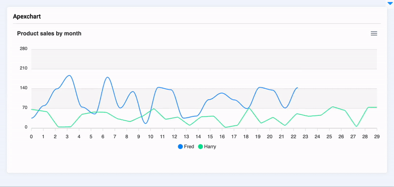
### Initialize `Apexchart` widget
```python
apexchart = Apexchart(
series=[{"name": "Fred", "data": s1}, {"name": "Harry", "data": s2}],
options={
"chart": {"type": "line", "zoom": {"enabled": False}},
"dataLabels": {"enabled": False},
"stroke": {"curve": "smooth", "width": 2},
"title": {"text": "Product sales by month", "align": "left"},
"grid": {"row": {"colors": ["#f3f3f3", "transparent"], "opacity": 0.5}},
"xaxis": {"type": "category"},
},
type="line",
)
```
### Create app layout
Prepare a layout for app using `Card` widget with the `content` parameter.
```python
info_text = Text(status="info")
card = Card(title="Apexchart", content=Container([apexchart, info_text]))
```
### Create app using layout
Create an app object with layout parameter.
```python
app = sly.Application(layout=card)
```
### Add functions to control widgets from python code
```python
@apexchart.click
def show_info(datapoint: sly.app.widgets.Apexchart.ClickedDataPoint):
x = datapoint.x
y = datapoint.y
name = datapoint.series_name
info_text.text = f"On May {x}, {name} has sold {y} units of the product."
if int(y) > 160:
info_text.status = "success"
elif int(y) < 50:
info_text.status = "error"
else:
info_text.status = "info"
```
### height
Widget height
**type:** `Union[int, str]`
**default value:** `"300"`
```python
apexchart = Apexchart(
# series=...,
# options=...,
# type=...,
height="500"
)
```
### sly\_options
Additional options used in supervisely component.
**type:** `dict`
## Methods and attributes
| Attributes and Methods | Description |
| :-------------------------------------------------------------------------------------------------------------------: | ------------------------------------------------- |
| `get_clicked_value()` | Get value of clicked datapoint. |
| `get_clicked_datapoint()` | Get clicked datapoint. |
| `set_title(title: str, send_changes: bool = True)` | Set chart title. |
| `add_series(name: str, x: list, y: list, send_changes: bool = True)` | Add new series to chart. |
| `set_series(series: list, send_changes: bool = True)` | Set series to chart. |
| `set_colors(colors: List[str or List[int]], send_changes: bool = True)` | Set colors for series in chart (str, RGB or HEX). |
| `add_to_series(name_or_id: str or int, data: List[tuple] or List[dict] or tuple or dict], send_changes: bool = True)` | Add data to exist series. |
| `get_series_by_name(name: str)` | Return series data by name. |
| `@click` | Decorator function to handle chart click. |
## Mini App Example
You can find this example in our GitHub repository:
[ui-widgets-demos/charts and plots/003\_apex\_chart/src/main.py](https://github.com/supervisely-ecosystem/ui-widgets-demos/blob/master/charts%20and%20plots/003_apex_chart/src/main.py)
### Import libraries
```python
import os
import numpy as np
import supervisely as sly
from dotenv import load_dotenv
from supervisely.app.widgets import Apexchart, Card
```
### Init API client
First, we load environment variables with credentials and init API for communicating with Supervisely Instance:
```python
load_dotenv("local.env")
load_dotenv(os.path.expanduser("~/supervisely.env"))
api = sly.Api()
```
### Prepare series for chart
```python
size1 = 22
x1 = list(range(size1))
y1 = np.random.randint(low=10, high=180, size=size1).tolist()
s1 = [{"x": x, "y": y} for x, y in zip(x1, y1)]
size2 = 30
x2 = list(range(size2))
y2 = np.random.randint(low=0, high=300, size=size2).tolist()
s2 = [{"x": x, "y": y} for x, y in zip(x2, y2)]
```
### Initialize `Apexchart` widget
```python
apexchart = Apexchart(
series=[{"name": "Fred", "data": s1}, {"name": "Harry", "data": s2}],
options={
"chart": {"type": "line", "zoom": {"enabled": False}},
"dataLabels": {"enabled": False},
"stroke": {"curve": "smooth", "width": 2},
"title": {"text": "Product sales by month", "align": "left"},
"grid": {"row": {"colors": ["#f3f3f3", "transparent"], "opacity": 0.5}},
"xaxis": {"type": "category"},
},
type="line",
)
```
### Create app layout
Prepare a layout for app using `Card` widget with the `content` parameter.
```python
info_text = Text(status="info")
card = Card(title="Apexchart", content=Container([apexchart, info_text]))
```
### Create app using layout
Create an app object with layout parameter.
```python
app = sly.Application(layout=card)
```
### Add functions to control widgets from python code
```python
@apexchart.click
def show_info(datapoint: sly.app.widgets.Apexchart.ClickedDataPoint):
x = datapoint.x
y = datapoint.y
name = datapoint.series_name
info_text.text = f"On May {x}, {name} has sold {y} units of the product."
if int(y) > 160:
info_text.status = "success"
elif int(y) < 50:
info_text.status = "error"
else:
info_text.status = "info"
```