> For the complete documentation index, see [llms.txt](https://developer.supervisely.com/llms.txt). Markdown versions of documentation pages are available by appending `.md` to page URLs; this page is available as [Markdown](https://developer.supervisely.com/app-development/widgets/charts-and-plots/linechart.md).
# LineChart
## Introduction
**`Linechart`** is a Supervisely widget that allows for visualizing data as a line chart. It supports data in pandas dataframe format or a Python list of dictionaries with a specific structure. This widget could be considered an advanced version of a `LinePlot` widget with the support of [ApexCharts](https://apexcharts.com/) library.
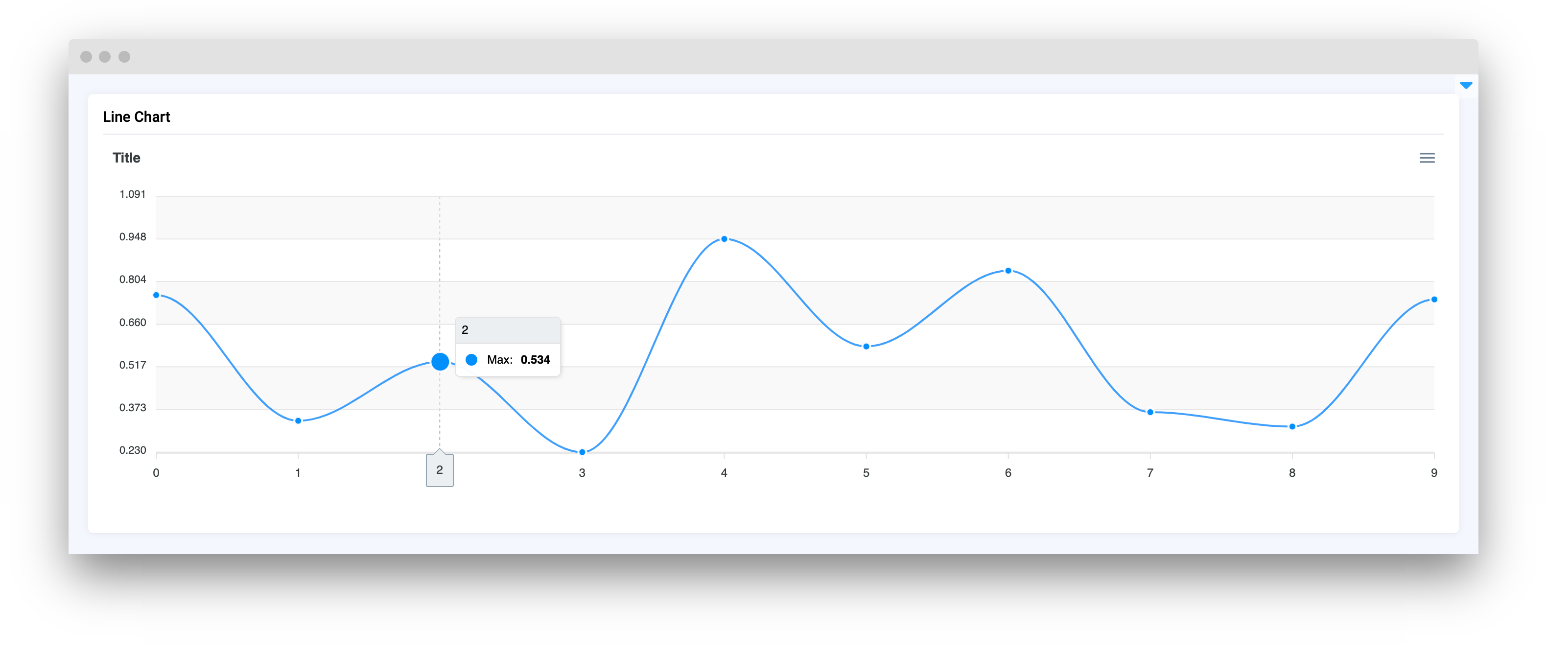
The widget allows for customization of the chart title, axis titles, and color scheme. `Linechart` also supports zooming, panning, and downloading the chart as png, svg, or csv. Additionally, it can detect clicks on data points and respond to them through Python code
## Function signature
```python
size1 = 10
x1 = list(range(size1))
y1 = np.random.randint(low=10, high=148, size=size1).tolist()
s1 = [{"x": x, "y": y} for x, y in zip(x1, y1)]
size2 = 30
x2 = list(range(size2))
y2 = np.random.randint(low=0, high=300, size=size2).tolist()
s2 = [{"x": x, "y": y} for x, y in zip(x2, y2)]
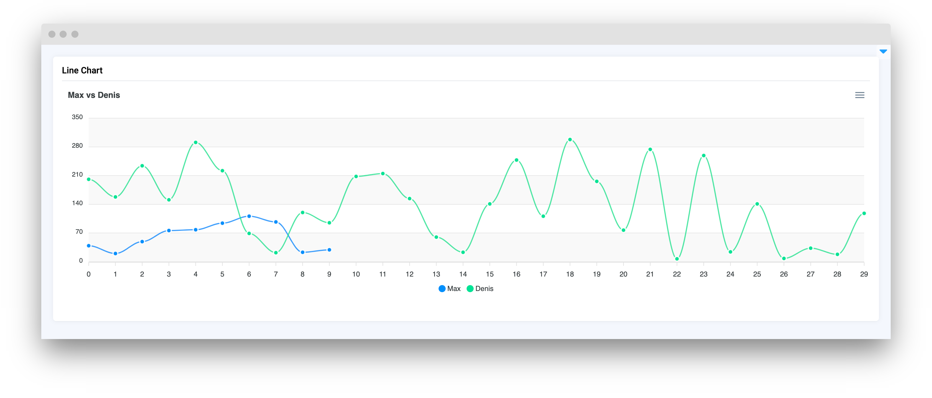
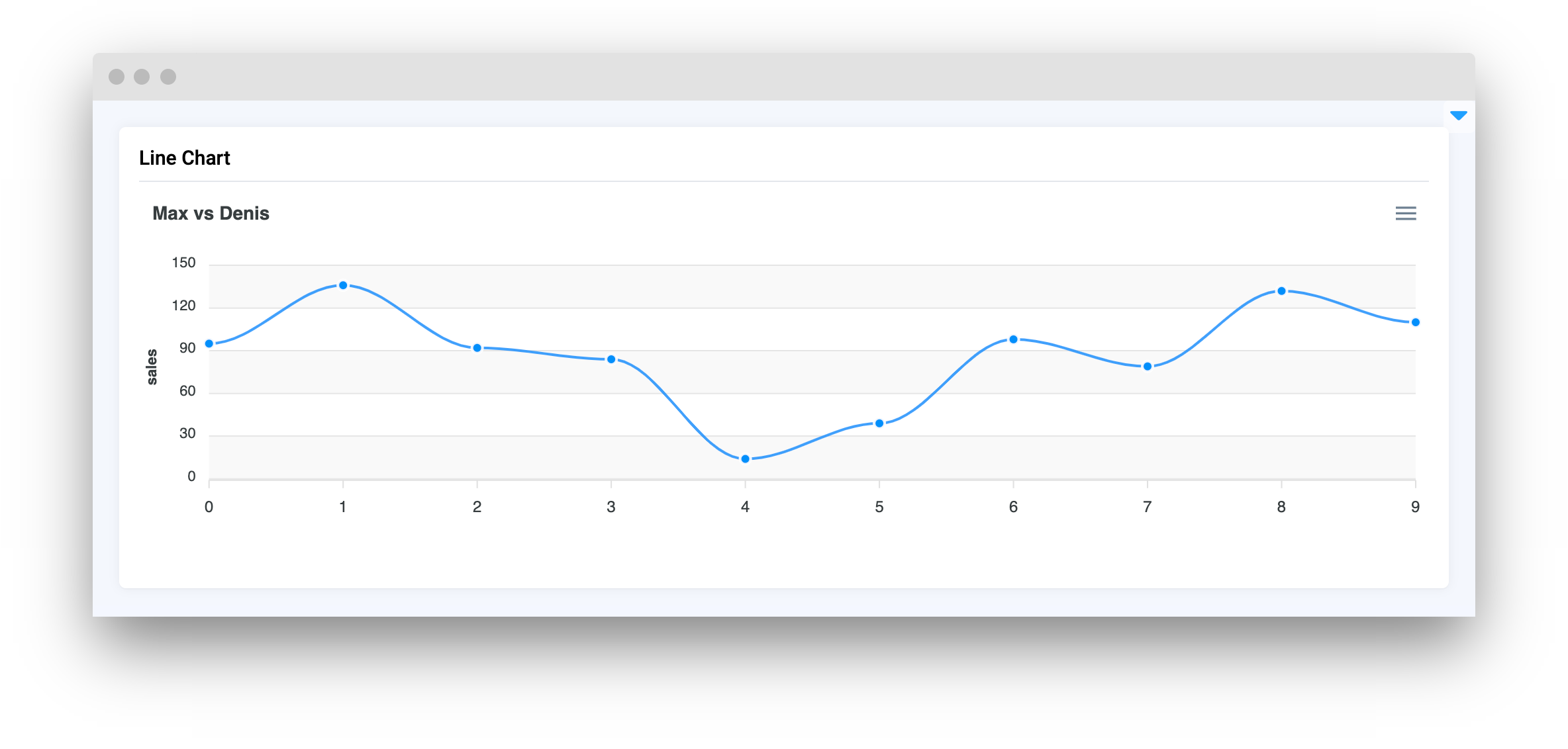
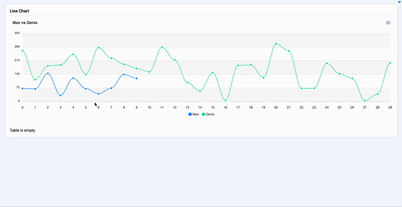
line_chart = LineChart(
title="Max vs Denis",
series=[{"name": "Max", "data": s1}, {"name": "Denis", "data": s2}],
xaxis_type="category",
)
```
## Parameters
| Parameters | Type | Description |
| :-----------------: | :------------------------------------------: | :--------------------------------------------------------------: |
| `title` | `str` | Line chart title |
| `series` | `list` | List of series including names and lists of `X`, `Y` coordinates |
| `zoom` | `bool` | Enable zoom on `Linechart` |
| `stroke_curve` | `Literal["smooth", "straight"]` | Set line type (straight or curved) |
| `stroke_width` | `int` | Set line width |
| `markers_size` | `int` | Set point markers size |
| `data_labels` | `bool` | If `True` it will display `Y` value of data for each datapoint |
| `xaxis_type` | `Literal["numeric", "category", "datetime"]` | Set type of divisions on `X` axis |
| `xaxis_title` | `str` | Set title for the `X` axis |
| `yaxis_title` | `str` | Set title for the `Y` axis |
| `yaxis_autorescale` | `bool` | Set autoscaling of the Y axis |
| `height` | `Union[int, str]` | Widget height |
| `decimalsInFloat` | `int` | Set number of decimals in float values of `Y` axis |
| `data_type` | `Literal["dict", "tuple"]` | The representation of xy coordinates. Default as a dictionary. |
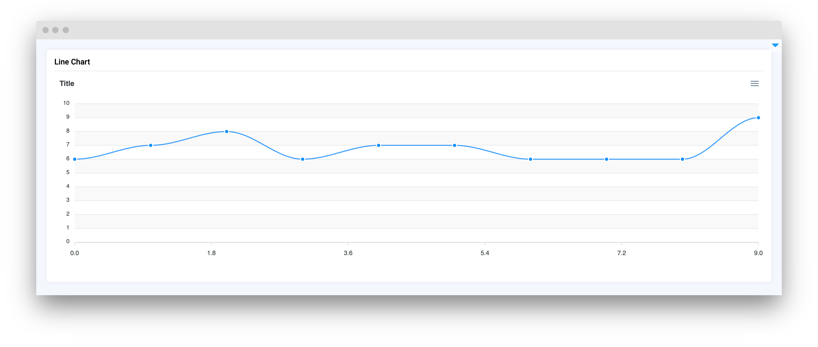
### title
Line chart title
**type:** `str`
```python
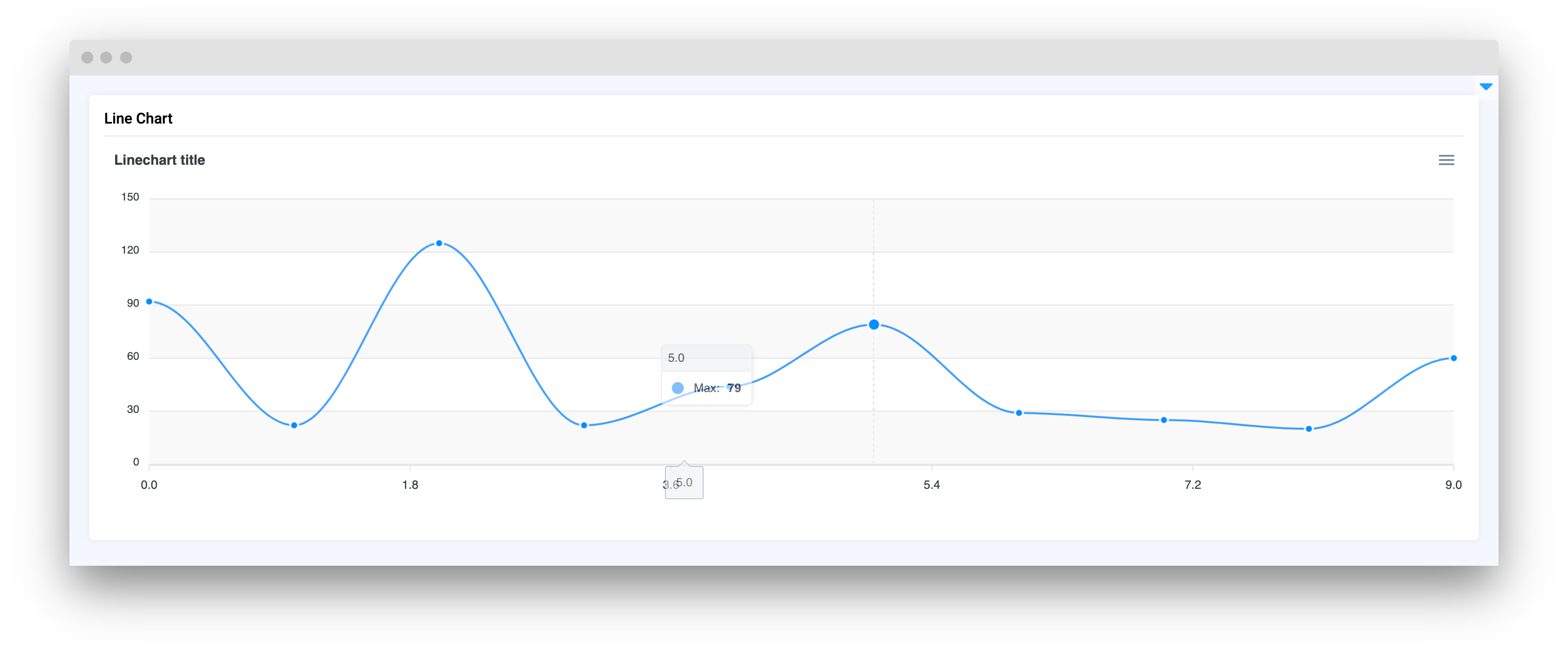
line_chart = LineChart(
title="Linechart title",
series=[{"name": "Max", "data": s1}],
xaxis_type="numeric",
)
```
### series
List of series including names and lists of X, Y coordinates
**type:** `list`
```python
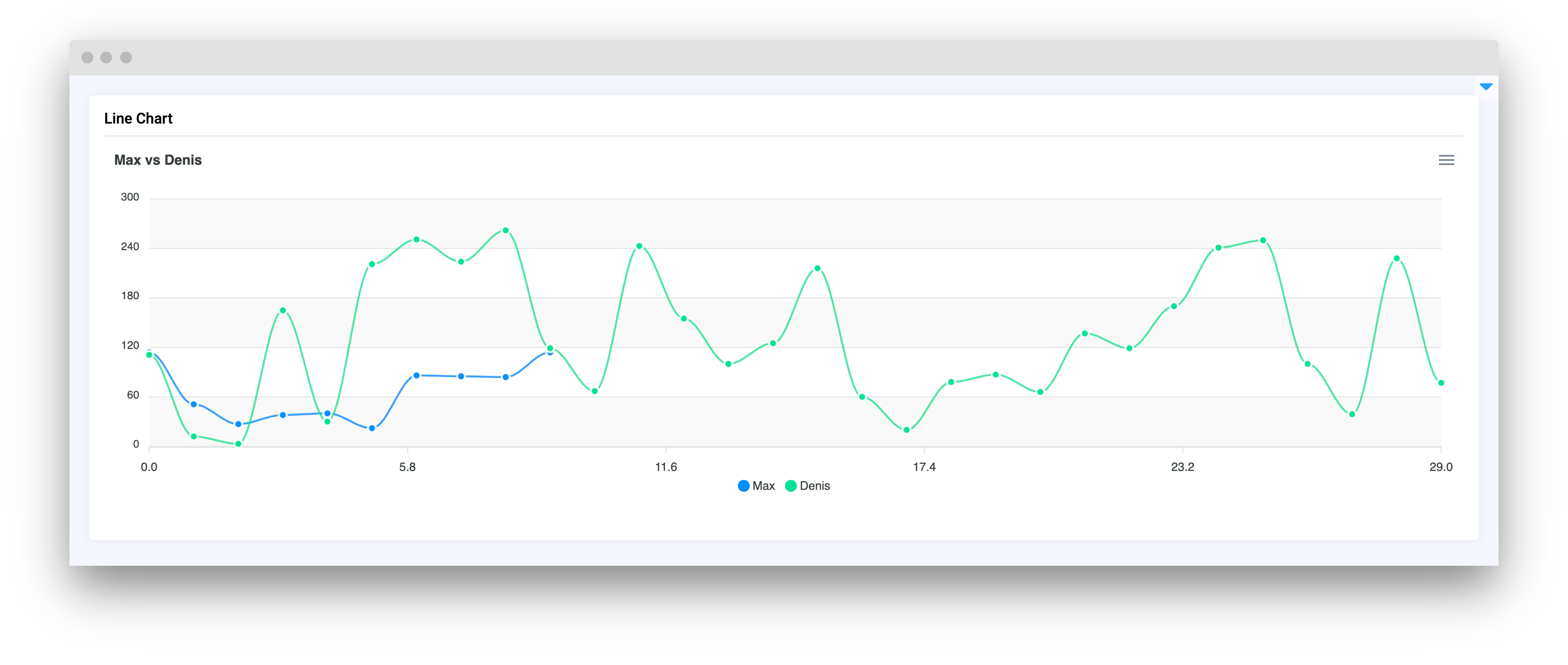
line_chart = LineChart(
title="Max vs Denis",
series=[{"name": "Max", "data": s1}, {"name": "Denis", "data": s2}],
xaxis_type="numeric",
)
```
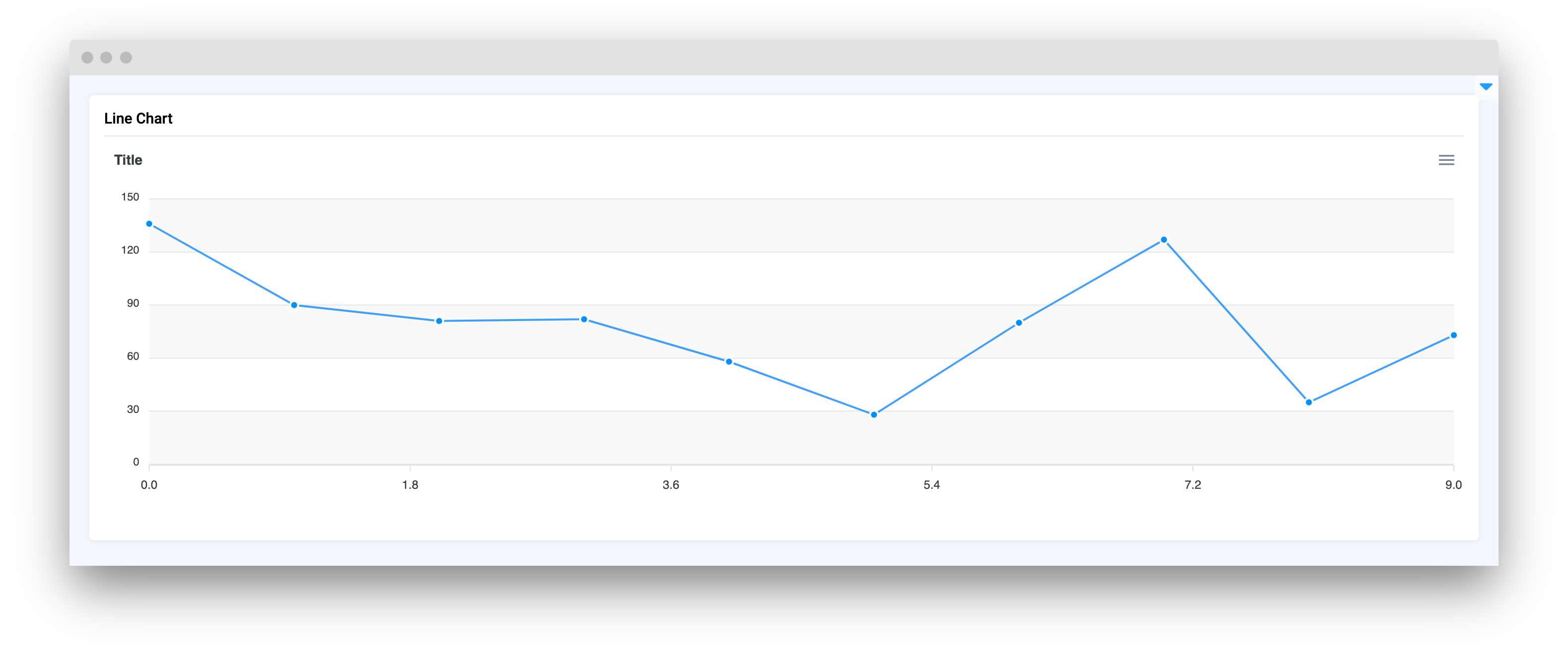
### zoom
Enable zoom on `Linechart`
**type:** `bool`
**default** `False`
```python
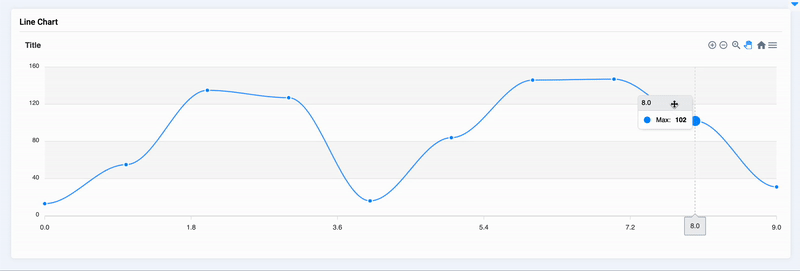
line_chart = LineChart(
title="Title",
series=[{"name": "Max", "data": s1}],
zoom=True
)
```
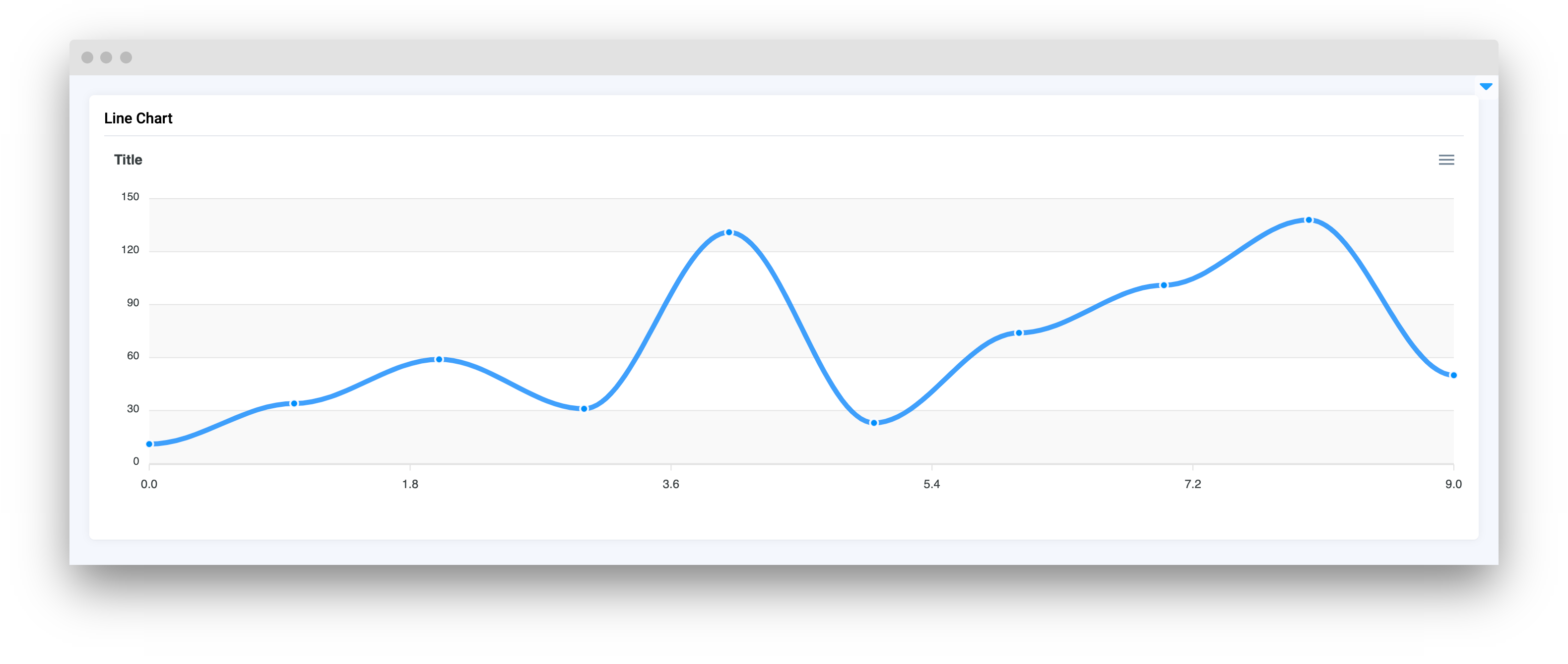
### stroke\_curve
Set line type (straight or curved)
**type:** `Literal["smooth", "straight"]`
**default** `"smooth"`
```python
line_chart = LineChart(
title="Title",
series=[{"name": "Max", "data": s1}],
stroke_curve="straight"
)
```
### stroke\_width
Set line width
**type:** `int`
**default** `2`
```python
line_chart = LineChart(
title="Title",
series=[{"name": "Max", "data": s1}],
stroke_width=5
)
```
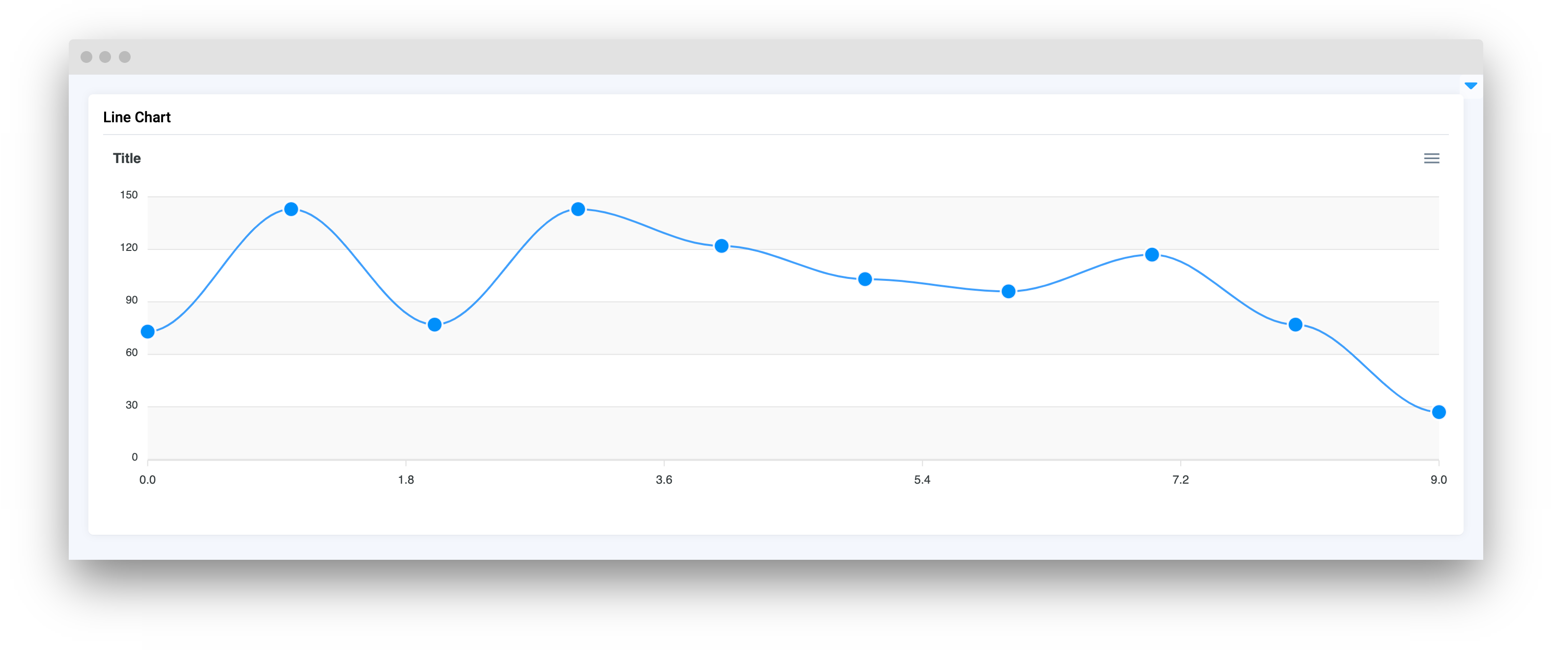
### markers\_size
Set point markers size
**type:** `int`
**default** `4`
```python
line_chart = LineChart(
title="Title",
series=[{"name": "Max", "data": s1}],
markers_size=8
)
```
### data\_labels
If `True` it will display `Y` value of data for each
**type:** `bool`
**default** `False`
```python
line_chart = LineChart(
title="Title",
series=[{"name": "Max", "data": s1}],
data_labels=True
)
```
### xaxis\_type
Set type of divisions on X axis
**type:** `Literal["numeric", "category", "datetime"]`
**default** `numeric`
```python
line_chart = LineChart(
title="Title",
series=[{"name": "Max", "data": s1}],
xaxis_type="numeric",
)
```
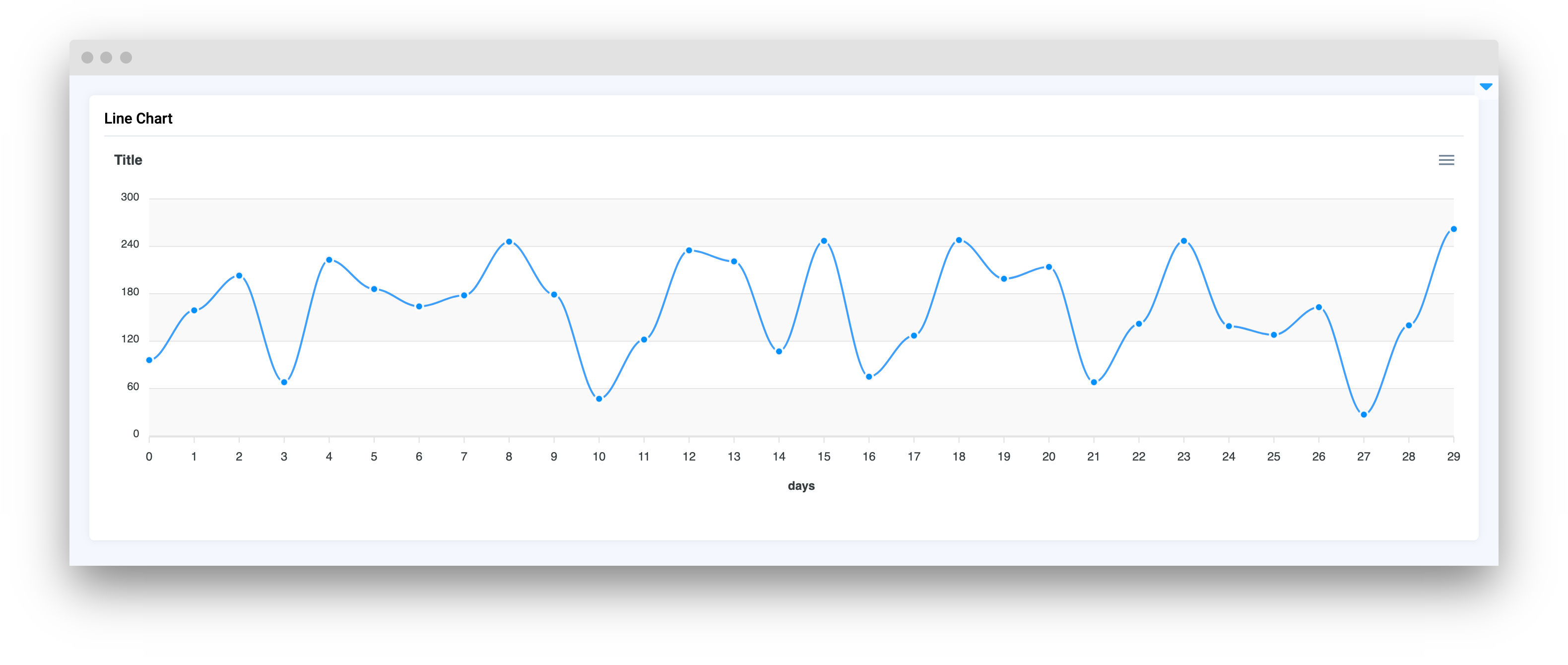
### xaxis\_title
Set title for the X axis
**type:** `str`
**default** `None`
```python
line_chart = LineChart(
title="Title",
series=[{"name": "Max", "data": s1}],
xaxis_type="category",
xaxis_title="days",
)
```
### yaxis\_title
Set title for the Y axis
**type:** `str`
**default** `None`
```python
line_chart = LineChart(
title="Title",
series=[{"name": "Max", "data": s1}],
xaxis_type="category",
yaxis_title="sales",
)
```
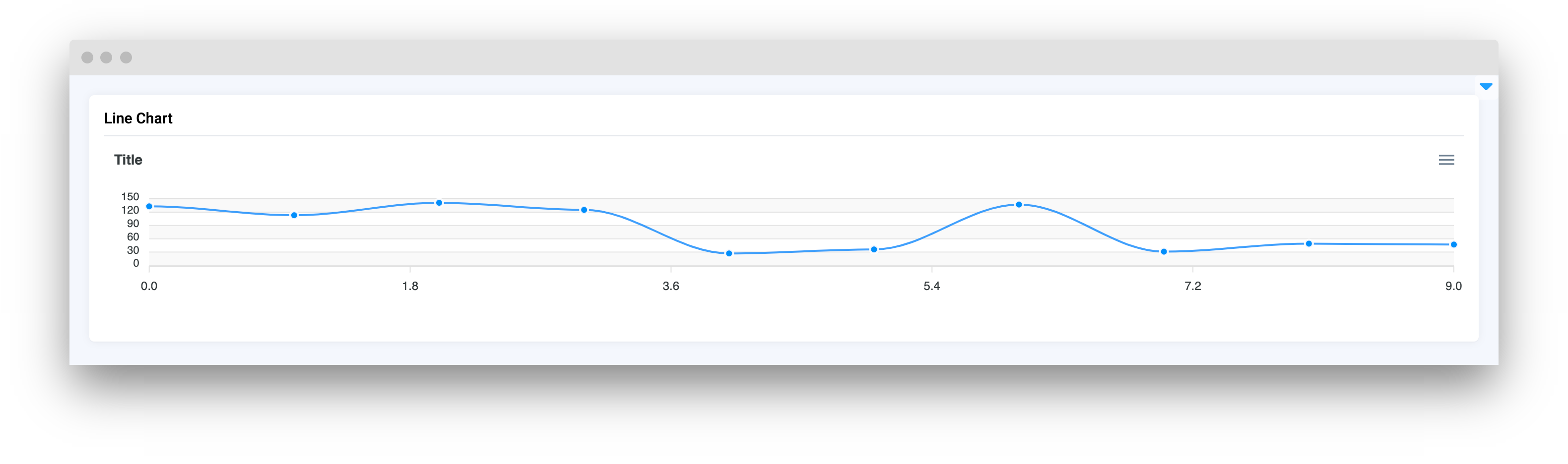
### yaxis\_autorescale
Set autoscaling of the Y axis
**type:** `bool`
**default** `True`
```python
line_chart = LineChart(
title="Title",
series=[{"name": "Max", "data": s1}],
yaxis_autorescale=False
)
```
### height
Widget height
**type:** `Union[int, str]`
**default** `350`
```python
line_chart = LineChart(
title="Title",
series=[{"name": "Max", "data": s1}],
height=150
)
```
### decimalsInFloat
Set number of decimals in float values of `Y` axis
**type:** `int`
**default** `2`
```python
line_chart = LineChart(
title="Title",
series=[{"name": "Max", "data": s1}],
decimalsInFloat=1
)
```
## Methods and attributes
| Attributes and Methods | Description |
| :-------------------------------------------------------: | ----------------------------------------- |
| `update_y_range(ymin: int, ymax: int, send_changes=True)` | Update chart `Y` axis range. |
| `get_clicked_value()` | Get value of clicked datapoint. |
| `get_clicked_datapoint()` | Get clicked datapoint. |
| `set_title(title: str, send_changes: bool = True)` | Set chart title. |
| `add_series(name: str, x: list, y: list)` | Add new series to chart. |
| `add_series_batch(series: dict)` | Add batch of series to chart. |
| `set_series(series: list, description: str)` | Set series to chart. |
| `set_colors(colors: list, description: str)` | Set colors for series in chart. |
| `@click` | Decorator function to handle chart click. |
## Mini App Example
You can find this example in our Github repository:
[ui-widgets-demos/charts and plots/001\_line\_chart/src/main.py](https://github.com/supervisely-ecosystem/ui-widgets-demos/blob/master/charts%20and%20plots/001_line_chart/src/main.py)
### Import libraries
```python
import os
import numpy as np
import supervisely as sly
from dotenv import load_dotenv
from supervisely.app.widgets import Card, Container, LineChart, Table
```
### Init API client
First, we load environment variables with credentials and init API for communicating with Supervisely Instance:
```python
load_dotenv("local.env")
load_dotenv(os.path.expanduser("~/supervisely.env"))
api = sly.Api()
```
### Prepare series for chart
```python
size1 = 10
x1 = list(range(size1))
y1 = np.random.randint(low=10, high=148, size=size1).tolist()
s1 = [{"x": x, "y": y} for x, y in zip(x1, y1)]
size2 = 30
x2 = list(range(size2))
y2 = np.random.randint(low=0, high=300, size=size2).tolist()
s2 = [{"x": x, "y": y} for x, y in zip(x2, y2)]
```
### Initialize `LineChart` widget
```python
line_chart = LineChart(
title="Max vs Denis",
series=[{"name": "Max", "data": s1}, {"name": "Denis", "data": s2}],
xaxis_type="category",
)
```
### Create app layout
Prepare a layout for app using `Card` widget with the `content` parameter.
```python
row_id = 1
columns = ["id", "Line", "x", "y"]
result_table = Table(data=[], columns=columns, width="25%")
container = Container(widgets=[line_chart, result_table])
card = Card(title="Line Chart", content=container)
```
### Create app using layout
Create an app object with layout parameter.
```python
app = sly.Application(layout=card)
```
### Add functions to control widgets from python code
```python
@line_chart.click
def add_row_to_table(datapoint: LineChart.ClickedDataPoint):
global row_id
row = [row_id, datapoint.series_name, datapoint.x, datapoint.y]
row_id += 1
result_table.insert_row(row)
```