> For the complete documentation index, see [llms.txt](https://developer.supervisely.com/llms.txt). Markdown versions of documentation pages are available by appending `.md` to page URLs; this page is available as [Markdown](https://developer.supervisely.com/app-development/widgets/controls/button.md).
# Button
## Introduction
**`Button`** widget in Supervisely is a user interface element that allows users to create clickable buttons in the appliactions. These buttons can be customized with text, size, colors, and icons, and can be used to trigger specific actions or workflows. The Button widget is a versatile tool that can help users automate repetitive tasks or streamline their workflows, making it a valuable addition to any project dashboard.
## Function signature
```python
Button(
text="Button",
button_type="primary",
button_size=None,
plain=False,
show_loading=True,
icon=None,
icon_gap=5,
widget_id=None,
)
```
## Parameters
| Parameters | Type | Description |
| :-------------: | :------------------------------------------------------------------: | :--------------------------------------------------------------------------------: |
| `text` | `str` | Determine text that displayed on the button |
| `button_type` | `Literal["primary", "info", "warning", "danger", "success", "text"]` | Button type |
| `button_size` | `Literal["mini", "small", "large", None]` | Button size |
| `plain` | `bool` | Determine whether button is a plain button |
| `show_loading` | `bool` | If `True` display loading animation when `loading` property is `True` |
| `icon` | `str` | Button icon, accepts an icon name of icon from Material Design Iconic Font library |
| `icon_gap` | `int` | Gap between icon and button text |
| `emit_on_click` | `str` | Emit an event on click |
| `call_on_click` | `str` | Call JavaScript function on click |
| `widget_id` | `str` | ID of the widget |
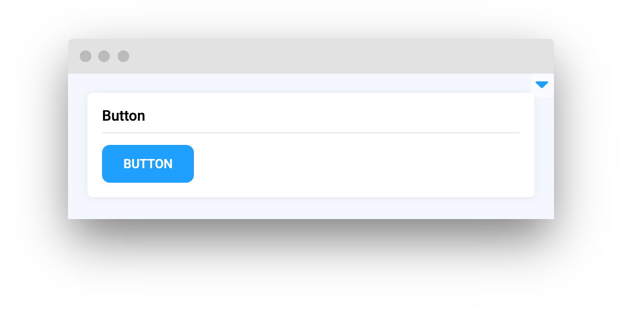
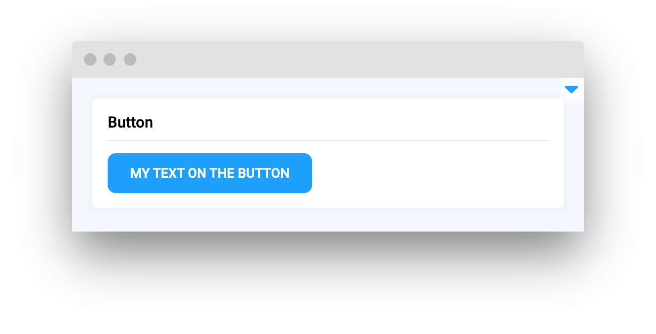
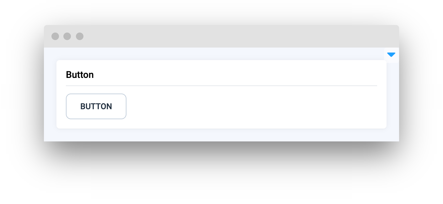
### text
Determine text that will be displayed on the button.
**type:** `str`
**default value:** `Button`
```python
button = Button(text="My text on the button")
```
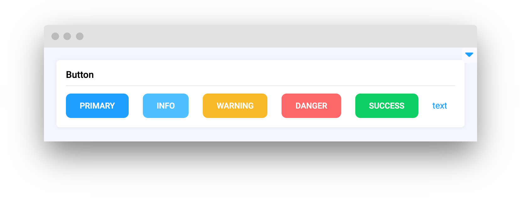
### button\_type
Button type.
**type:** `Literal["primary", "info", "warning", "danger", "success", "text"]`
**default value:** `"primary"`
```python
button_primary = Button(text="primary", button_type="primary")
button_info = Button(text="info", button_type="info")
button_warning = Button(text="warning", button_type="warning")
button_danger = Button(text="danger", button_type="danger")
button_success = Button(text="success", button_type="success")
button_text = Button(text="text", button_type="text")
```
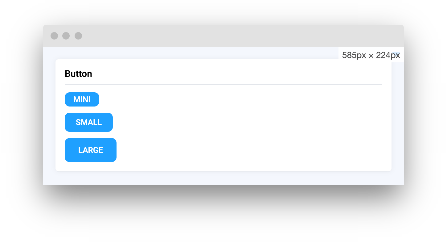
### button\_size
Button size.
**type:** `Literal["mini", "small", "large", None]`
**default value:** `None`
```python
button_mini = Button(text="mini", button_size="mini")
button_small = Button(text="small", button_size="small")
button_large = Button(text="large", button_size="large")
```
### plain
Determine whether button is a plain button.
**type:** `bool`
**default value:** `False`
```python
button_plain = Button(plain=True)
```
### show\_loading
Determine whether button is loading.
**type:** `bool`
**default value:** `False`
```python
button_1 = Button(show_loading=False)
button_2 = Button(show_loading=True)
```
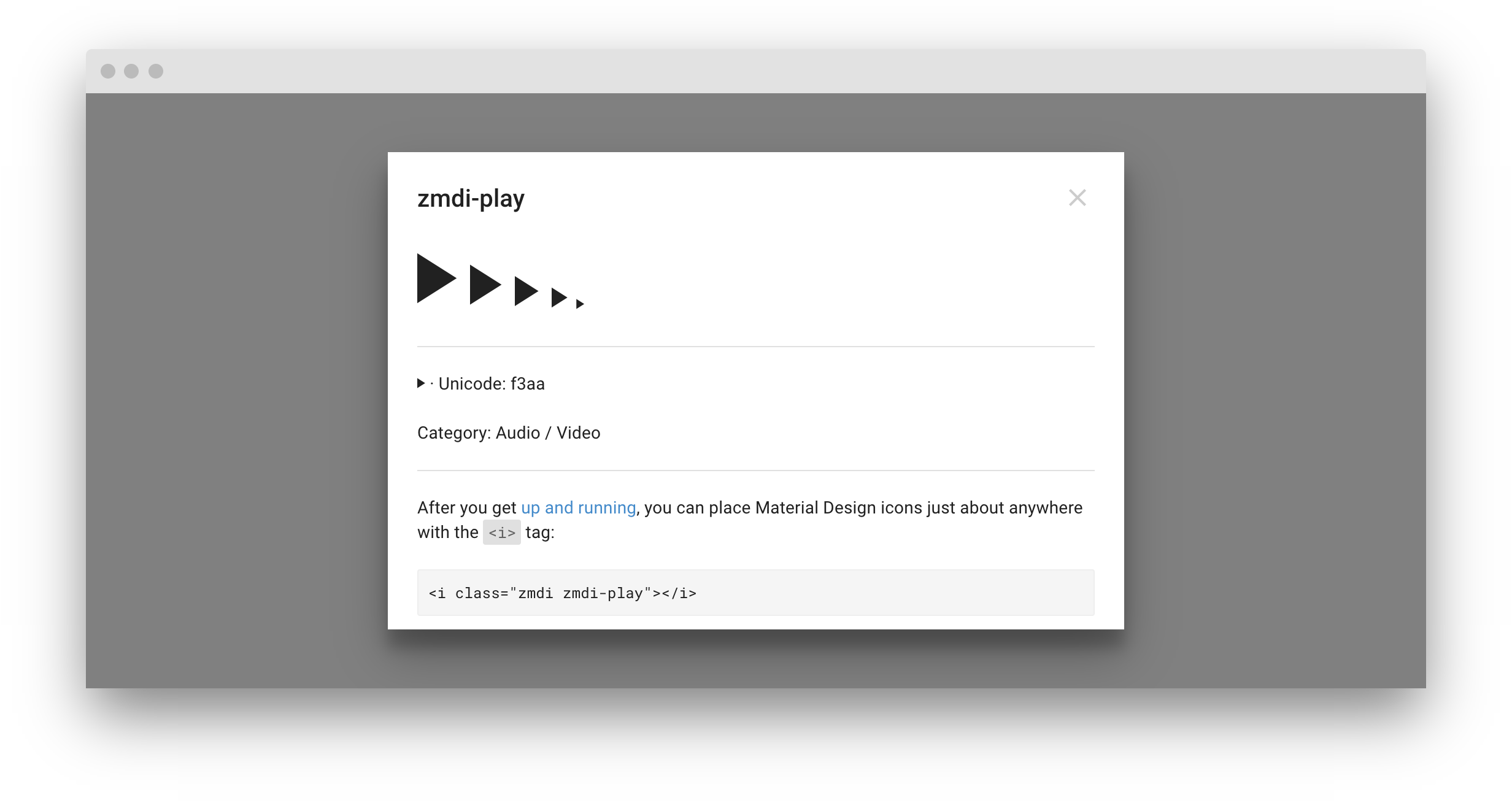
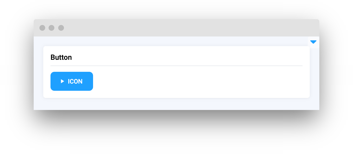
### icon
Button icon, accepts an icon name of icon component. Icons can be found at [zavoloklom.github.io](http://zavoloklom.github.io/material-design-iconic-font/icons.html).
Open any icon at [zavoloklom.github.io](http://zavoloklom.github.io/material-design-iconic-font/icons.html) and copy it's name (see example below).
**type:** `str`
**default value:** `None`
```python
button_icon = Button(text="icon", icon="zmdi zmdi-play")
```
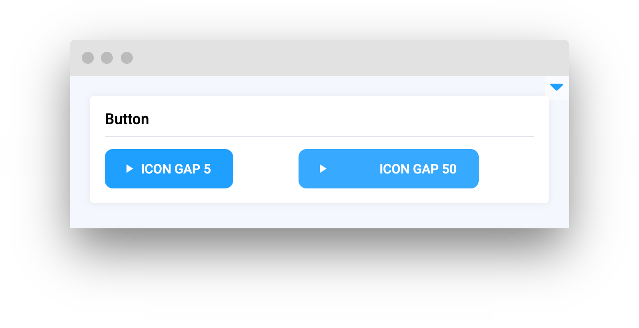
### icon\_gap
Gap between icon and button text.
**type:** `int`
**default value:** `5`
```python
button_icon_gap_5 = Button(text="icon gap 5", icon="zmdi zmdi-play", icon_gap=5)
button_icon_gap_50 = Button(text="icon gap 50", icon="zmdi zmdi-play", icon_gap=50)
```
### emit\_on\_click
Emit an event on click
**type:** `str`
**default value:** `""`
```python
button = Button(text="Open Sidebar", emit_on_click="openSidebar")
```
### style
Specifies an inline style for an element.
**type:** `str`
**default value:** ""
```python
button = button("OK", style="padding: 5px;")
```
### call\_on\_click
Call JavaScript function on click.
**type:** `str`
**default value:** `""`
```python
button = Button(text="Save", call_on_click="closeSidebar();")
```
### widget\_id
ID of the widget.
**type:** `str`
**default value:** `None`
## Mini App Example
You can find this example in our Github repository:
[ui-widgets-demos/controls/001\_button/src/main.py](https://github.com/supervisely-ecosystem/ui-widgets-demos/blob/master/controls/001_button/src/main.py)
```python
import os
import supervisely as sly
from dotenv import load_dotenv
from supervisely.app.widgets import Button, Card, Container, Text
```
### Init API client
Init API for communicating with Supervisely Instance. First, we load environment variables with credentials:
```python
load_dotenv("local.env")
load_dotenv(os.path.expanduser("~/supervisely.env"))
api = sly.Api()
```
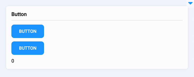
### Initialize `Button` and `Text` widgets
```python
button_add = Button(text="Add", icon="zmdi zmdi-plus-1")
button_subtract = Button(text="Subtract", icon="zmdi zmdi-neg-1")
text_num = Text(text="0", status="text")
```
### Create app layout
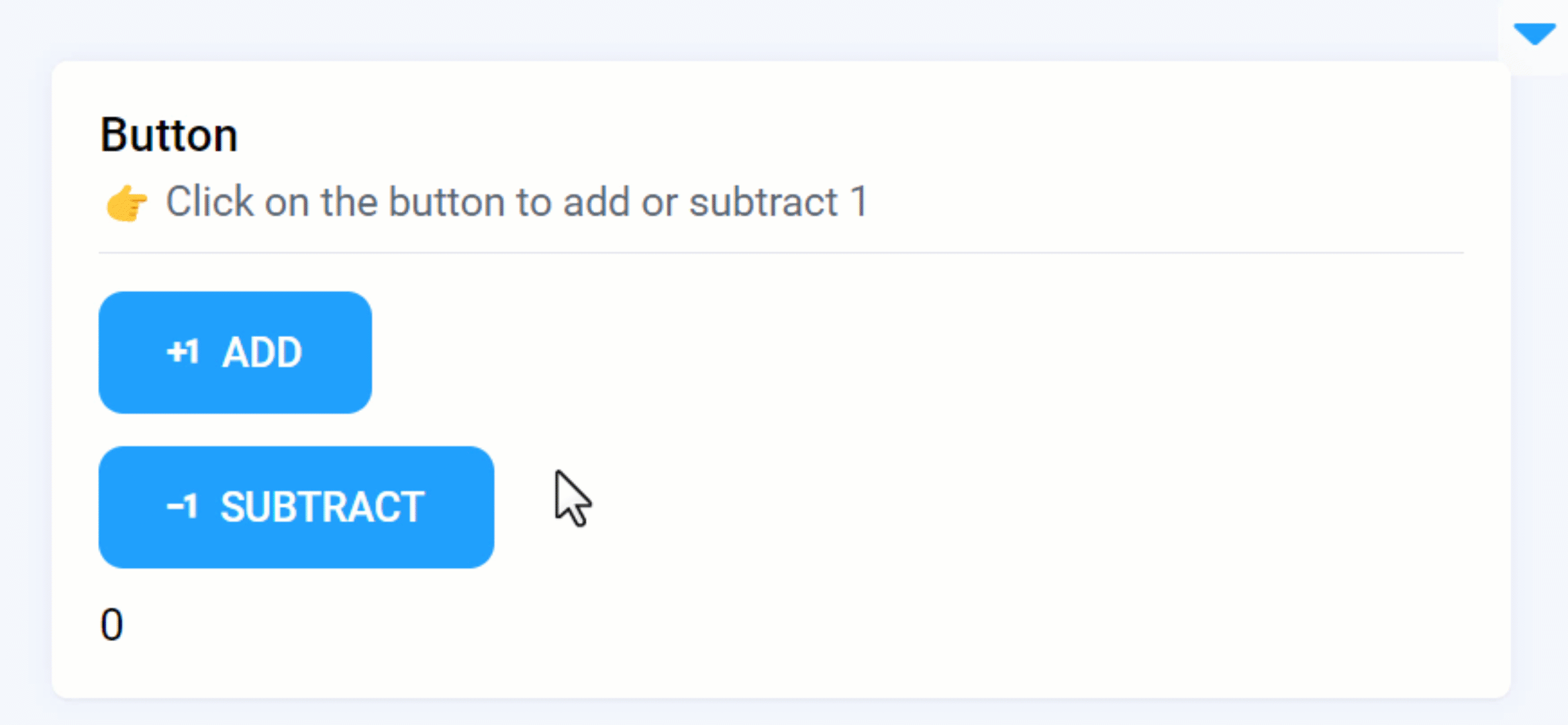
Prepare a layout for app using `Card` widget with the `content` parameter and place 3 widgets that we've just created in the `Container` widget. Place order in the `Container` is important, we want buttons to be displayed above `Text` widget.
```python
card = Card(
"Button",
description="👉 Click on the button to add or subtract 1",
content=Container([button_add, button_subtract, text_num]),
)
layout = Container(widgets=[card], direction="vertical")
```
### Create app using layout
Create an app object with layout parameter.
```python
app = sly.Application(layout=layout)
```
Our app layout is ready. It's time to handle button clicks.
### Handle button clicks
Use the decorator as shown below to handle button click. We have 2 buttons, one for adding and another one for subtracting
```python
@button_add.click
def add():
text_num.text = str(int(text_num.text) + 1)
@button_subtract.click
def subtract():
text_num.text = str(int(text_num.text) - 1)
```