> For the complete documentation index, see [llms.txt](https://developer.supervisely.com/llms.txt). Markdown versions of documentation pages are available by appending `.md` to page URLs; this page is available as [Markdown](https://developer.supervisely.com/app-development/widgets/controls/checkbox.md).
# Checkbox
## Introduction
This widget is a simple and intuitive interface element that allows users to select given option. The **`Checkbox`** widget can be customized with different label text and default state. By providing an easy and efficient way to make selections, the `Checkbox` widget is an essential tool for any image or video annotation project.
## Function signature
```python
checkbox = Checkbox(
content="Enable",
checked=False,
widget_id=None,
)
```
## Parameters
| Parameters | Type | Description |
| :---------: | :------------------: | :----------------------------------: |
| `content` | `Union[Widget, str]` | Checkbox content |
| `checked` | `bool` | Return `True` if checkbox is checked |
| `widget_id` | `str` | ID of the widget |
### content
Checkbox content.
**type:** `Union[Widget, str]`
```python
checkbox = Checkbox(content="Enable")
```
### checked
Whether Checkbox is checked. Return `True` if checked.
**type:** `bool`
**default value:** `False`
```python
checkbox = Checkbox(content="Enable", checked=True)
```
### widget\_id
ID of the widget.
**type:** `str`
**default value:** `None`
## Methods and attributes
| Attributes and Methods | Description |
| :--------------------: | ------------------------------------------------------------- |
| `is_checked()` | Return `True` if checked, else `False`. |
| `check()` | Enable `checked` property. |
| `uncheck()` | Disable `checked` property. |
| `@value_changed` | Decorator function is handled when checkbox value is changed. |
## Mini App Example
You can find this example in our Github repository:
[ui-widgets-demos/controls/002\_checkbox/src/main.py](https://github.com/supervisely-ecosystem/ui-widgets-demos/blob/master/controls/002_checkbox/src/main.py)
### Import libraries
```python
import os
import supervisely as sly
from dotenv import load_dotenv
from supervisely.app.widgets import (
Button,
Card,
Checkbox,
Container,
NotificationBox,
SelectDataset,
)
```
### Init API client
First, we load environment variables with credentials and init API for communicating with Supervisely Instance:
```python
load_dotenv("local.env")
load_dotenv(os.path.expanduser("~/supervisely.env"))
api = sly.Api()
```
### Initialize `Project ID` we will use
```python
project_id = sly.env.project_id()
```
### Initialize `Checkbox` widget
```python
checkbox = Checkbox(
content="Enable",
checked=False,
)
```
### Create more widgets
In this tutorial we will use `SelectDataset`, `Button`, `NotificationBox` widgets to show how to control `Checkbox` widget from python code.
```python
select_dataset = SelectDataset(
project_id=project_id,
compact=True,
)
show_btn = Button(text="Show info")
note = NotificationBox()
note.hide()
```
### Create app layout
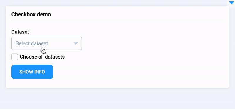
Prepare a layout for app using `Card` widget with the `content` parameter and place widget that we've just created in the `Container` widget.
```python
# create new cards
card = Card(
title="Checkbox demo",
content=Container(widgets=[select_dataset, checkbox, show_btn, note]),
)
layout = Container(widgets=[card])
```
### Create app using layout
Create an app object with layout parameter.
```python
app = sly.Application(layout=layout)
```
### Add functions to control widget from python code
```python
@checkbox.value_changed
def hide_notification(value):
if value is True:
select_dataset.disable()
else:
select_dataset.enable()
note.hide()
@show_btn.click
def show_info():
images_count = 0
if checkbox.is_checked():
datasets_list = api.dataset.get_list(project_id=project_id)
select_dataset.disable()
for dataset in datasets_list:
images_count += dataset.images_count if dataset.images_count is not None else 0
else:
ds_id = select_dataset.get_selected_id()
dataset = api.dataset.get_info_by_id(ds_id)
images_count = dataset.images_count
note.title = f"Total count of images in selected datasets: {images_count}."
note.show()
```