> For the complete documentation index, see [llms.txt](https://developer.supervisely.com/llms.txt). Markdown versions of documentation pages are available by appending `.md` to page URLs; this page is available as [Markdown](https://developer.supervisely.com/app-development/widgets/layouts-and-containers/card.md).
# Card
## Introduction
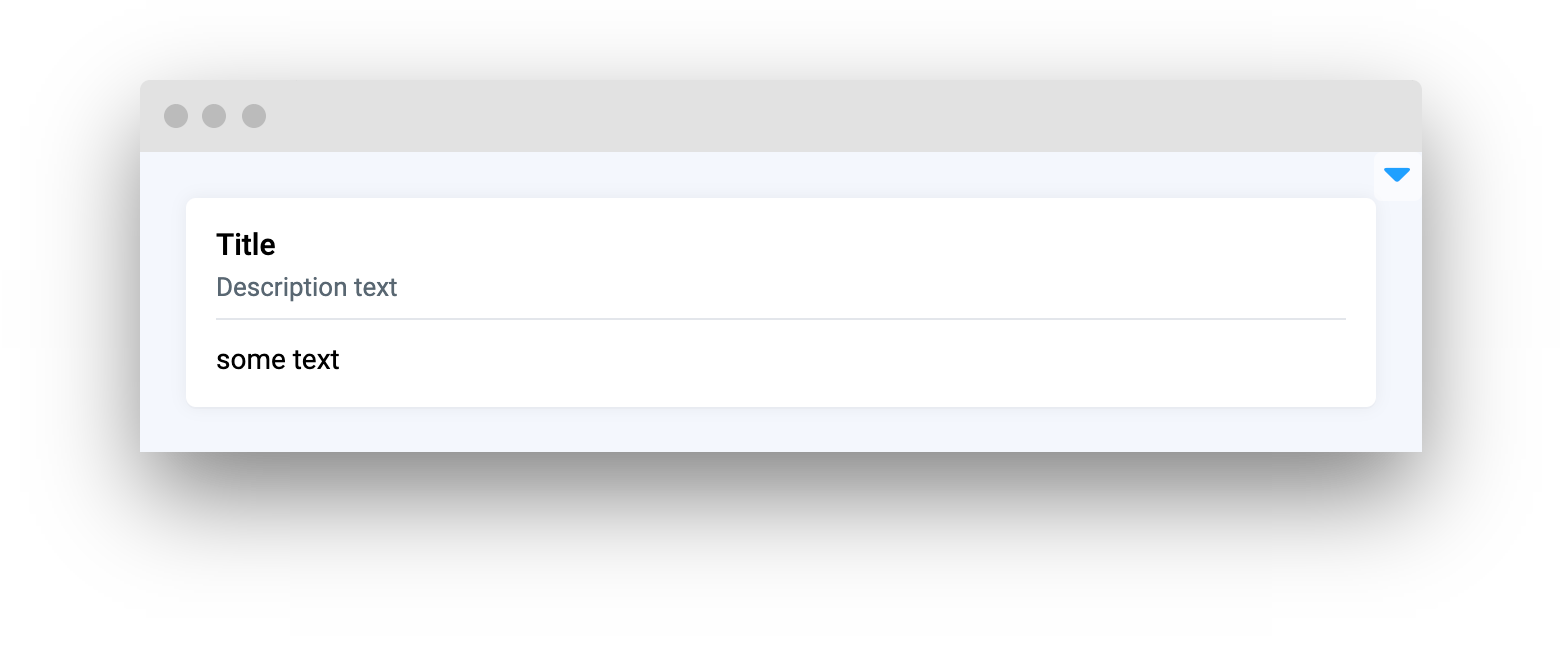
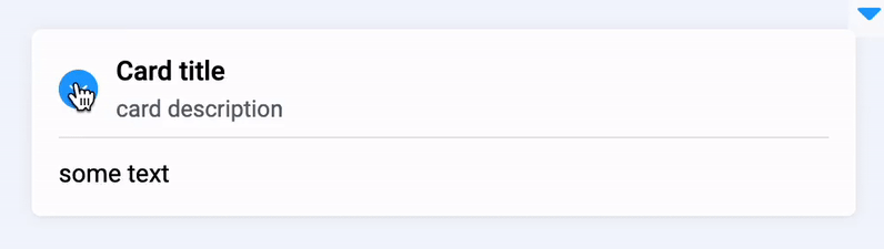
**`Card`** widget in Supervisely is a simple widget that can be used to display information or content in a compact format. It can be controlled by setting `loading`/`lock` properties and can be collapsed to save space. It provides a straightforward and easy-to-use solution for displaying information clearly and concisely.
## Function signature
```python
card = Card(
title="Title",
description="Description text",
collapsable=False,
content=Text("some text"),
content_top_right=None,
lock_message="Card content is locked",
widget_id=None,
)
```
 ## Parameters
| Parameters | Type | Description |
| :-----------------: | :------: | :---------------------------------------------------------: |
| `title` | `str` | Card widget title |
| `description` | `str` | Description text for card widget |
| `collapsable` | `bool` | Enable `collapsable` property to allow minimize card widget |
| `content` | `Widget` | Widget to place in Card widget |
| `content_top_right` | `Widget` | Widget to place in top right corner of Card widget |
| `lock_message` | `str` | Message to display when card will be locked |
| `widget_id` | `str` | Widget ID |
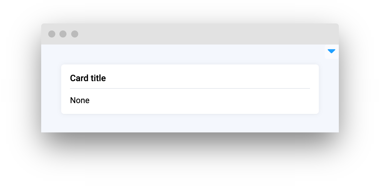
### title
Card widget title
**type:** `str`
**default** `None`
```python
card = Card(title="Card title")
```
## Parameters
| Parameters | Type | Description |
| :-----------------: | :------: | :---------------------------------------------------------: |
| `title` | `str` | Card widget title |
| `description` | `str` | Description text for card widget |
| `collapsable` | `bool` | Enable `collapsable` property to allow minimize card widget |
| `content` | `Widget` | Widget to place in Card widget |
| `content_top_right` | `Widget` | Widget to place in top right corner of Card widget |
| `lock_message` | `str` | Message to display when card will be locked |
| `widget_id` | `str` | Widget ID |
### title
Card widget title
**type:** `str`
**default** `None`
```python
card = Card(title="Card title")
```
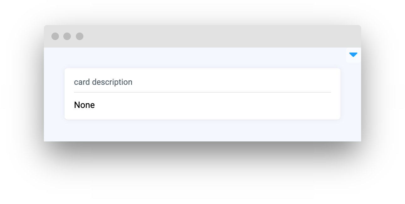
 ### description
Description text for card widget
**type:** `str`
**default** `None`
```python
card = Card(description="card description")
```
### description
Description text for card widget
**type:** `str`
**default** `None`
```python
card = Card(description="card description")
```
 ### collapsable
Enable `collapsable` property to allow minimize card widget
**type:** `bool`
**default** `False`
```python
card = Card(
title="Card title",
description="card description",
content=Text("some text"),
collapsable=True
)
```
### collapsable
Enable `collapsable` property to allow minimize card widget
**type:** `bool`
**default** `False`
```python
card = Card(
title="Card title",
description="card description",
content=Text("some text"),
collapsable=True
)
```
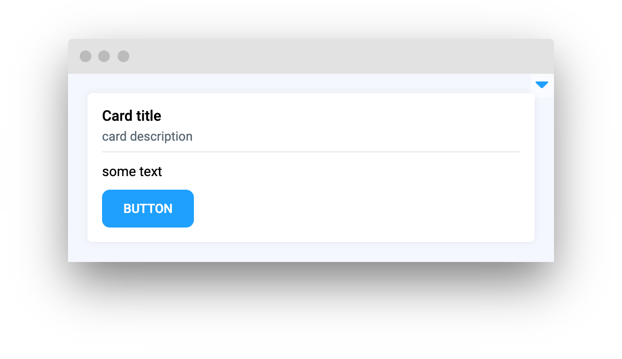
 ### content
Widget to place in Card widget
**type:** `Widget`
**default** `None`
```python
card = Card(
title="Card title",
description="card description",
content=Container(widgets=[Text("some text"), Button("Button")])
)
```
### content
Widget to place in Card widget
**type:** `Widget`
**default** `None`
```python
card = Card(
title="Card title",
description="card description",
content=Container(widgets=[Text("some text"), Button("Button")])
)
```
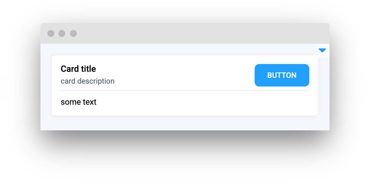
 ### content\_top\_right
Widget to place in top right corner of Card widget
**type:** `Widget`
**default** `None`
```python
card = Card(
title="Card title",
description="card description",
content=Text("some text"),
content_top_right=Button("Button"),
)
```
### content\_top\_right
Widget to place in top right corner of Card widget
**type:** `Widget`
**default** `None`
```python
card = Card(
title="Card title",
description="card description",
content=Text("some text"),
content_top_right=Button("Button"),
)
```
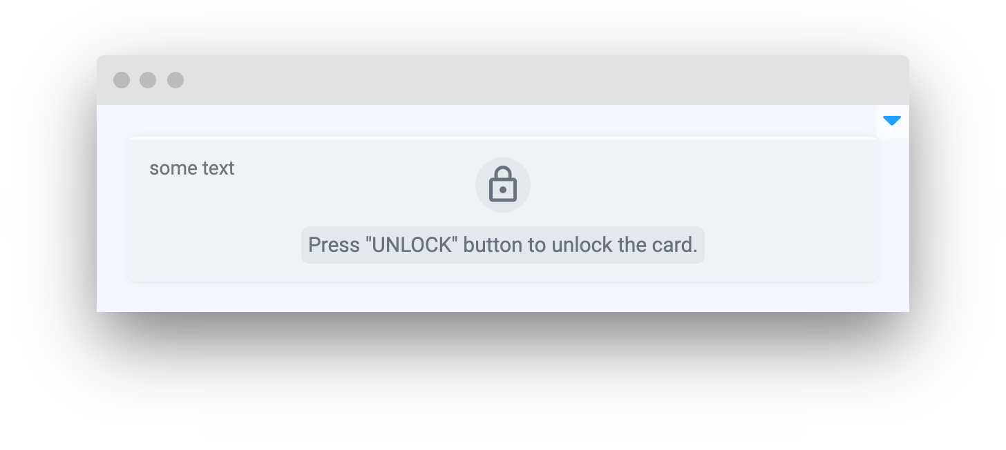
 ### lock\_message
Message to display when card will be locked
**type:** `str`
**default** `"Card content is locked"`
```python
card = Card(
content=Text("some text"),
lock_message='Press "UNLOCK" button to unlock the card.',
)
```
### lock\_message
Message to display when card will be locked
**type:** `str`
**default** `"Card content is locked"`
```python
card = Card(
content=Text("some text"),
lock_message='Press "UNLOCK" button to unlock the card.',
)
```
 ### widget\_id
Widget ID
**type:** `str`
**default** `None`
## Methods and attributes
| Attributes and Methods | Description |
| :--------------------: | ------------------------------------------ |
| `loading` | Get or set `loading` property. |
| `collapse()` | Minimize card widget. |
| `uncollapse()` | Expand card widget. |
| `is_collapsed()` | Checks if card widget is collapsed or not. |
| `lock()` | Lock card widget and show message. |
| `unlock()` | Unlock card widget and hide lock message. |
| `is_locked()` | Check if card widget is locked. |
## Mini App Example
You can find this example in our Github repository:
[ui-widgets-demos/layouts and containers/001\_card/src/main.py](https://github.com/supervisely-ecosystem/ui-widgets-demos/blob/master/layouts%20and%20containers/001_card/src/main.py)
### Import libraries
```python
import os
import random
import supervisely as sly
from dotenv import load_dotenv
from supervisely.app.widgets import Button, Card, Container, Image
```
### Init API client
First, we load environment variables with credentials and init API for communicating with Supervisely Instance:
```python
load_dotenv("local.env")
load_dotenv(os.path.expanduser("~/supervisely.env"))
api = sly.Api()
```
### Prepare widgets we will use in `Card` widget
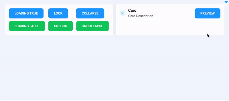
Buttons to enable loading property, lock and collapse `Card` widget:
```python
loading_btn = Button("Loading True")
lock_btn = Button("Lock")
collapse_btn = Button("Collapse")
```
Buttons to unlock, uncollapse and disable loading property of `Card` widget:
```python
unlock_btn = Button("Unlock", button_type="success")
uncollapse_btn = Button("Uncollapse", button_type="success")
refresh_btn = Button("Loading False", button_type="success")
```
Use `Container` widget to join `Button` widgets in groups.
```python
btn_container_1 = Container(widgets=[loading_btn, refresh_btn])
btn_container_2 = Container(widgets=[lock_btn, unlock_btn])
btn_container_3 = Container(widgets=[collapse_btn, uncollapse_btn])
containers = Container(
widgets=[btn_container_1, btn_container_2, btn_container_3],
direction="horizontal",
)
```
Prepare widgets to display some image.
```python
preview_btn = Button("Preview")
image = Image()
```
### Initialize `Card` widgets
Initialize one `Card` widget for buttons
```
buttons_card = Card(content=containers)
```
Initialize second `Card` widget for previewing images.
```python
image_card = Card(
title="Card",
description="Card Description",
content=image,
collapsable=True,
content_top_right=preview_btn,
)
```
### Create app layout
Prepare a layout for app using `Card` widget with the `content` parameter.
```python
layout = Container(
widgets=[buttons_card, image_card],
direction="horizontal",
fractions=[1, 1],
)
```
### Create app using layout
Create an app object with layout parameter.
```python
app = sly.Application(layout=card)
```
#### Add functions to control widgets from python code
```python
@unlock_btn.click
def lock_card():
image_card.unlock()
@uncollapse_btn.click
def lock_card():
image_card.uncollapse()
@refresh_btn.click
def lock_card():
image_card.loading = False
@lock_btn.click
def lock_card():
image_card.lock()
@collapse_btn.click
def lock_card():
image_card.collapse()
@loading_btn.click
def lock_card():
image_card.loading = True
@preview_btn.click
def load_preview_image():
image_card.loading = True
image.set(image_info.full_storage_url)
image_card.loading = False
```
### widget\_id
Widget ID
**type:** `str`
**default** `None`
## Methods and attributes
| Attributes and Methods | Description |
| :--------------------: | ------------------------------------------ |
| `loading` | Get or set `loading` property. |
| `collapse()` | Minimize card widget. |
| `uncollapse()` | Expand card widget. |
| `is_collapsed()` | Checks if card widget is collapsed or not. |
| `lock()` | Lock card widget and show message. |
| `unlock()` | Unlock card widget and hide lock message. |
| `is_locked()` | Check if card widget is locked. |
## Mini App Example
You can find this example in our Github repository:
[ui-widgets-demos/layouts and containers/001\_card/src/main.py](https://github.com/supervisely-ecosystem/ui-widgets-demos/blob/master/layouts%20and%20containers/001_card/src/main.py)
### Import libraries
```python
import os
import random
import supervisely as sly
from dotenv import load_dotenv
from supervisely.app.widgets import Button, Card, Container, Image
```
### Init API client
First, we load environment variables with credentials and init API for communicating with Supervisely Instance:
```python
load_dotenv("local.env")
load_dotenv(os.path.expanduser("~/supervisely.env"))
api = sly.Api()
```
### Prepare widgets we will use in `Card` widget
Buttons to enable loading property, lock and collapse `Card` widget:
```python
loading_btn = Button("Loading True")
lock_btn = Button("Lock")
collapse_btn = Button("Collapse")
```
Buttons to unlock, uncollapse and disable loading property of `Card` widget:
```python
unlock_btn = Button("Unlock", button_type="success")
uncollapse_btn = Button("Uncollapse", button_type="success")
refresh_btn = Button("Loading False", button_type="success")
```
Use `Container` widget to join `Button` widgets in groups.
```python
btn_container_1 = Container(widgets=[loading_btn, refresh_btn])
btn_container_2 = Container(widgets=[lock_btn, unlock_btn])
btn_container_3 = Container(widgets=[collapse_btn, uncollapse_btn])
containers = Container(
widgets=[btn_container_1, btn_container_2, btn_container_3],
direction="horizontal",
)
```
Prepare widgets to display some image.
```python
preview_btn = Button("Preview")
image = Image()
```
### Initialize `Card` widgets
Initialize one `Card` widget for buttons
```
buttons_card = Card(content=containers)
```
Initialize second `Card` widget for previewing images.
```python
image_card = Card(
title="Card",
description="Card Description",
content=image,
collapsable=True,
content_top_right=preview_btn,
)
```
### Create app layout
Prepare a layout for app using `Card` widget with the `content` parameter.
```python
layout = Container(
widgets=[buttons_card, image_card],
direction="horizontal",
fractions=[1, 1],
)
```
### Create app using layout
Create an app object with layout parameter.
```python
app = sly.Application(layout=card)
```
#### Add functions to control widgets from python code
```python
@unlock_btn.click
def lock_card():
image_card.unlock()
@uncollapse_btn.click
def lock_card():
image_card.uncollapse()
@refresh_btn.click
def lock_card():
image_card.loading = False
@lock_btn.click
def lock_card():
image_card.lock()
@collapse_btn.click
def lock_card():
image_card.collapse()
@loading_btn.click
def lock_card():
image_card.loading = True
@preview_btn.click
def load_preview_image():
image_card.loading = True
image.set(image_info.full_storage_url)
image_card.loading = False
```